German Legal Tech Awards — event brand identity
A complete event identity for the awards night of Germany's legal tech industry.
Geometry, colour, and restraint — shaped into an event brand built for stage light.
The German Legal Tech Awards are the annual awards night of Legal Tech Verband Deutschland, the association driving the digitalisation of the German legal market.
Our task was to give the awards an identity of their own while keeping them unmistakably part of the association. The system needed to hold from a stage screen to a printed badge, work under stage lighting rather than on a white page, and stay simple enough for the client's team to run the next edition without us.
Process
From concept to crafted detail.
A look at how the work came together — from early direction to the finished surfaces that ship.
The Challenge
Award ceremonies tend to borrow their look from whoever ran them last — a gold trophy, a dark gradient, a serif set in caps. The German Legal Tech Awards needed something that belonged to the association behind them and still stood on its own. The brief was to express authority and a forward-looking industry through a system minimal enough to be produced by a dozen people on the night of the event.
Logo & Symbol
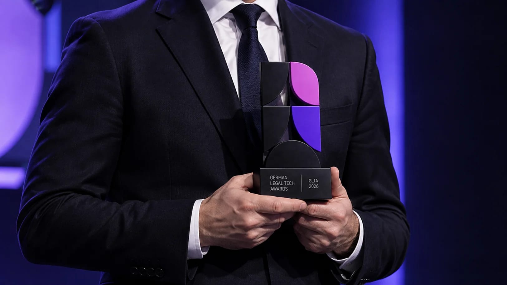
The monogram splits a circle into a semicircle and quarters — three solid, one petal-shaped — set inside the bracket Legal Tech Verband already uses. Magenta and violet mark the two live quarters: one colour inherited from the association, one new to the awards. The mark is built to hold at both ends of the evening, from a stage screen read across the room to a badge read at arm's length, and a year-dated version lets each edition date itself without a redesign.
Colour — built for stage light
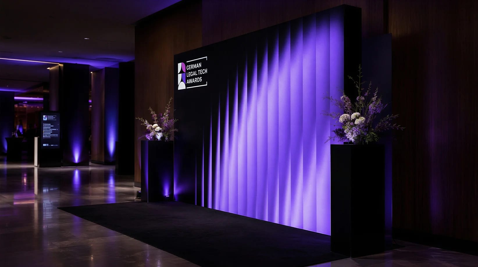
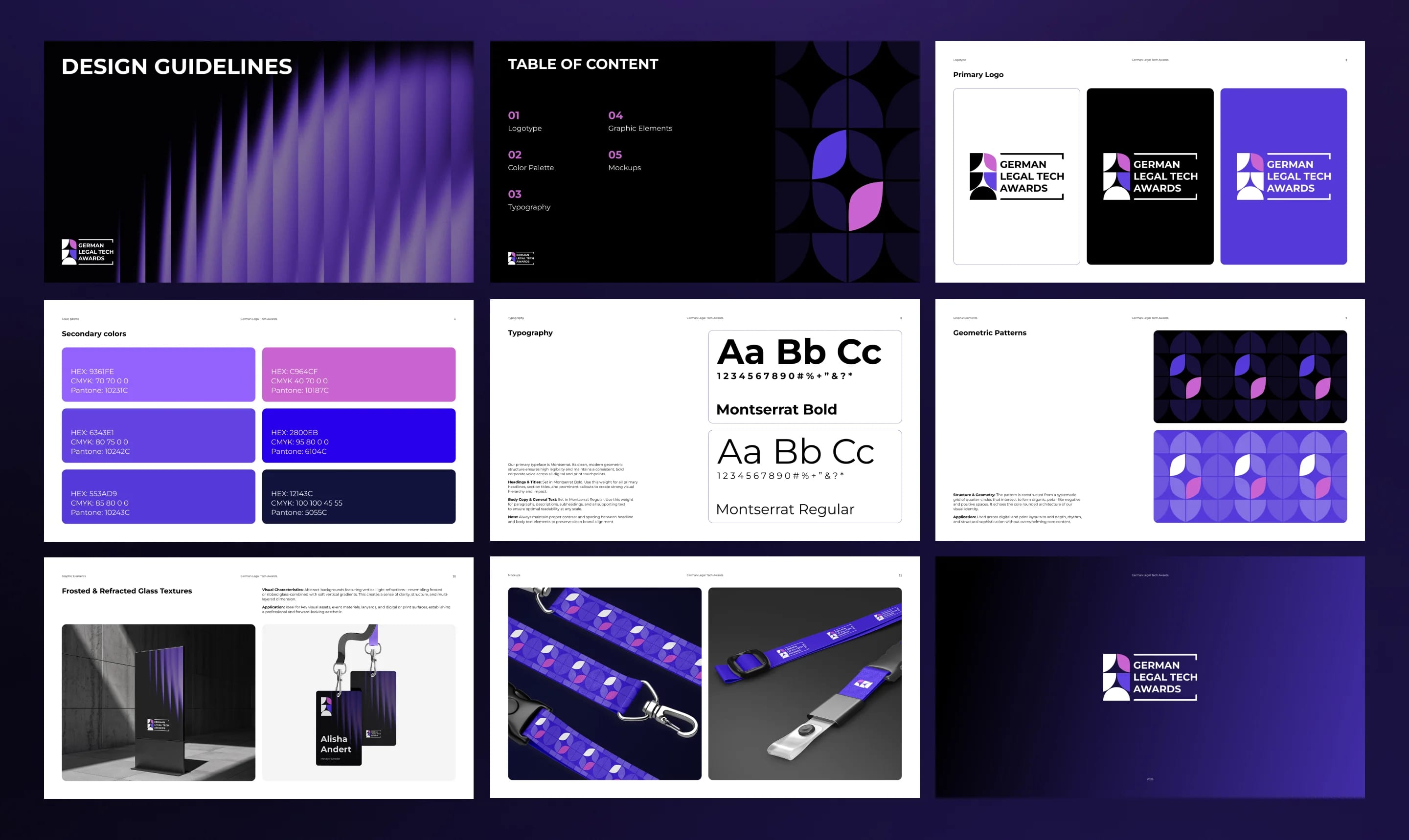
The awards are handed out in a dark hall under stage light, so the palette starts at near-black and moves through indigo into electric blue. Magenta is the single colour carried over from the parent brand, keeping the connection visible while the event holds a character of its own. Neutrals stay off-white and warm grey, and every value is specified in HEX, CMYK, and Pantone so the palette survives the move from presentation screens to print.
Typography — one family, two weights
Montserrat carries the whole event — Bold for headlines, category names, and winners on screen, Regular for everything else across presentations and event materials. Two weights are a deliberate limit: on the night of the event a dozen people produce material at once, and a system that cannot be misused is worth more than one with range.
Pattern & Texture
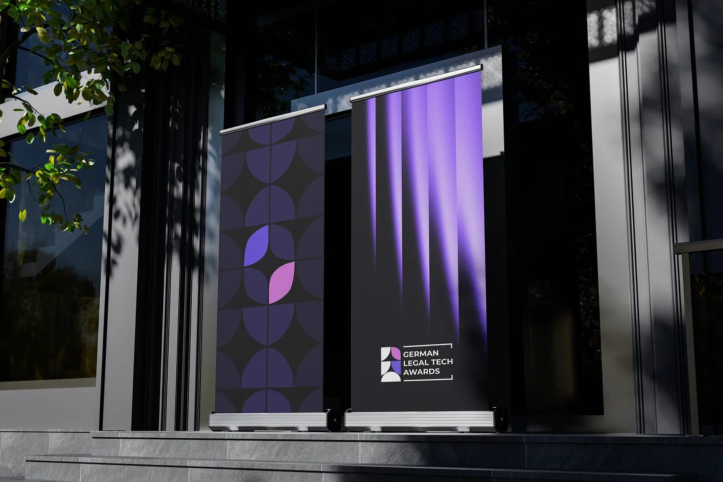
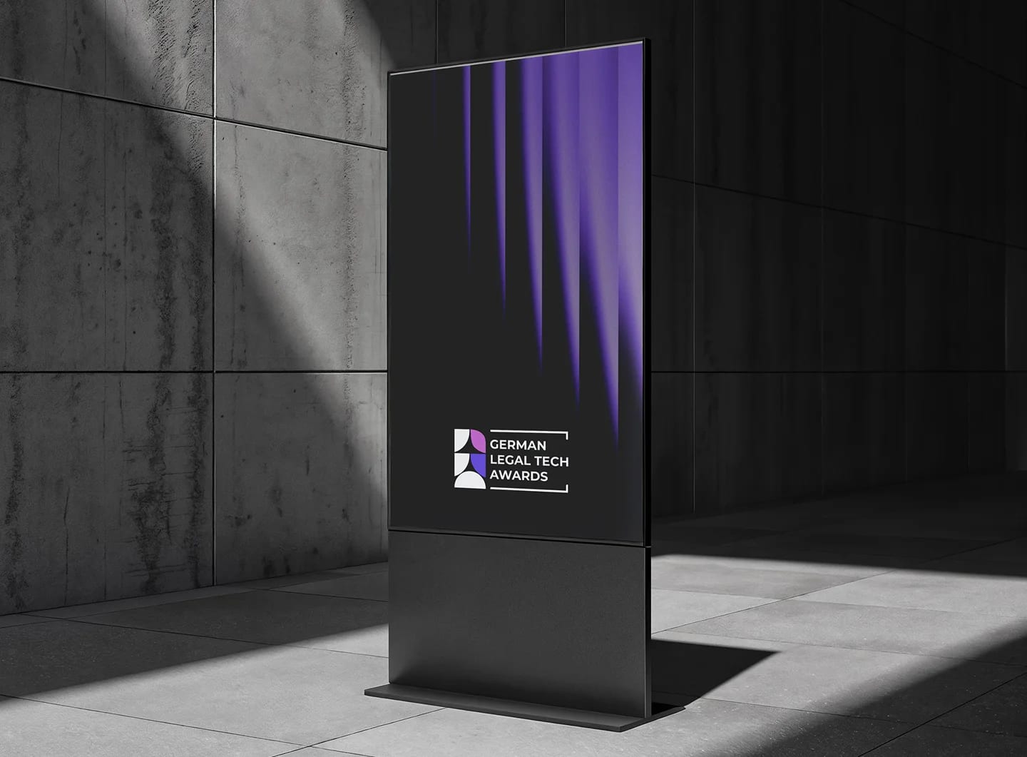
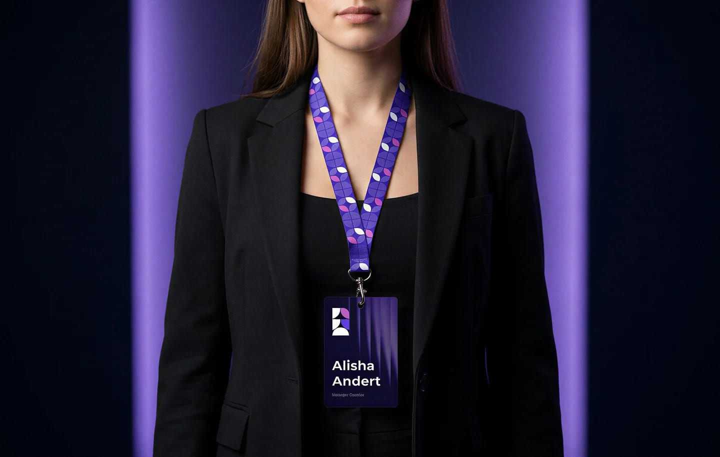
The same geometry as the monogram, repeated and reinterpreted: quarter-circles on a strict grid, meeting to form petal-shaped negative space. It scales from a 20 mm lanyard strip to a full stage backdrop — texture from a distance, structure up close. A frosted-glass texture sits underneath it, adding depth on posters, badges, and covers, and photographing well under stage lighting instead of flattening out.
Applications — one evening, every surface
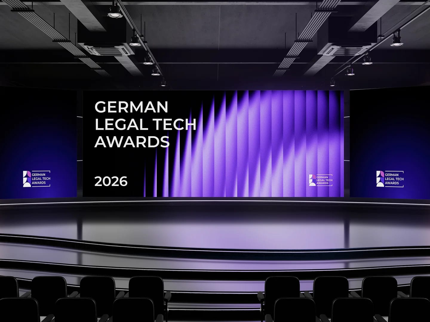
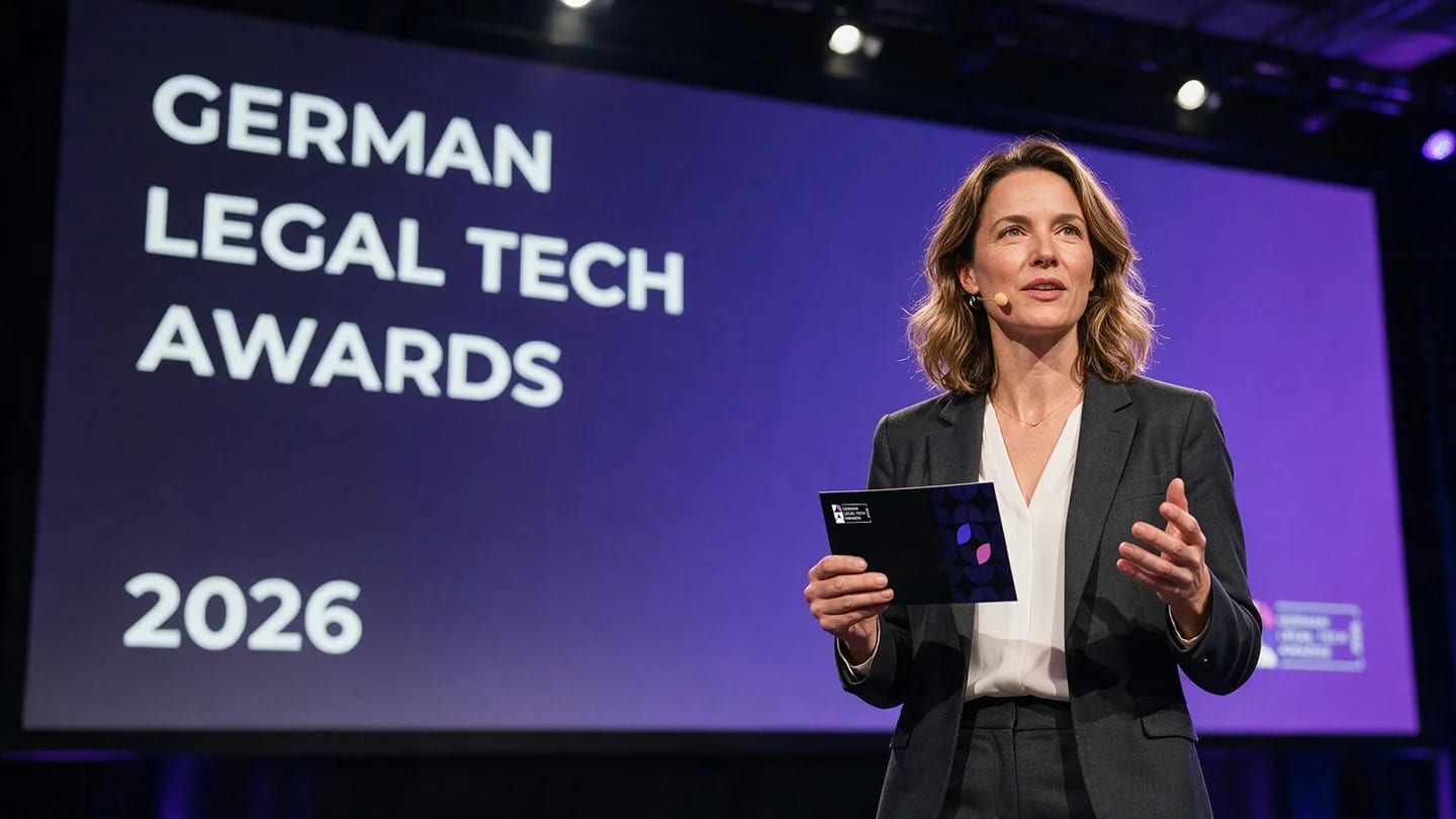
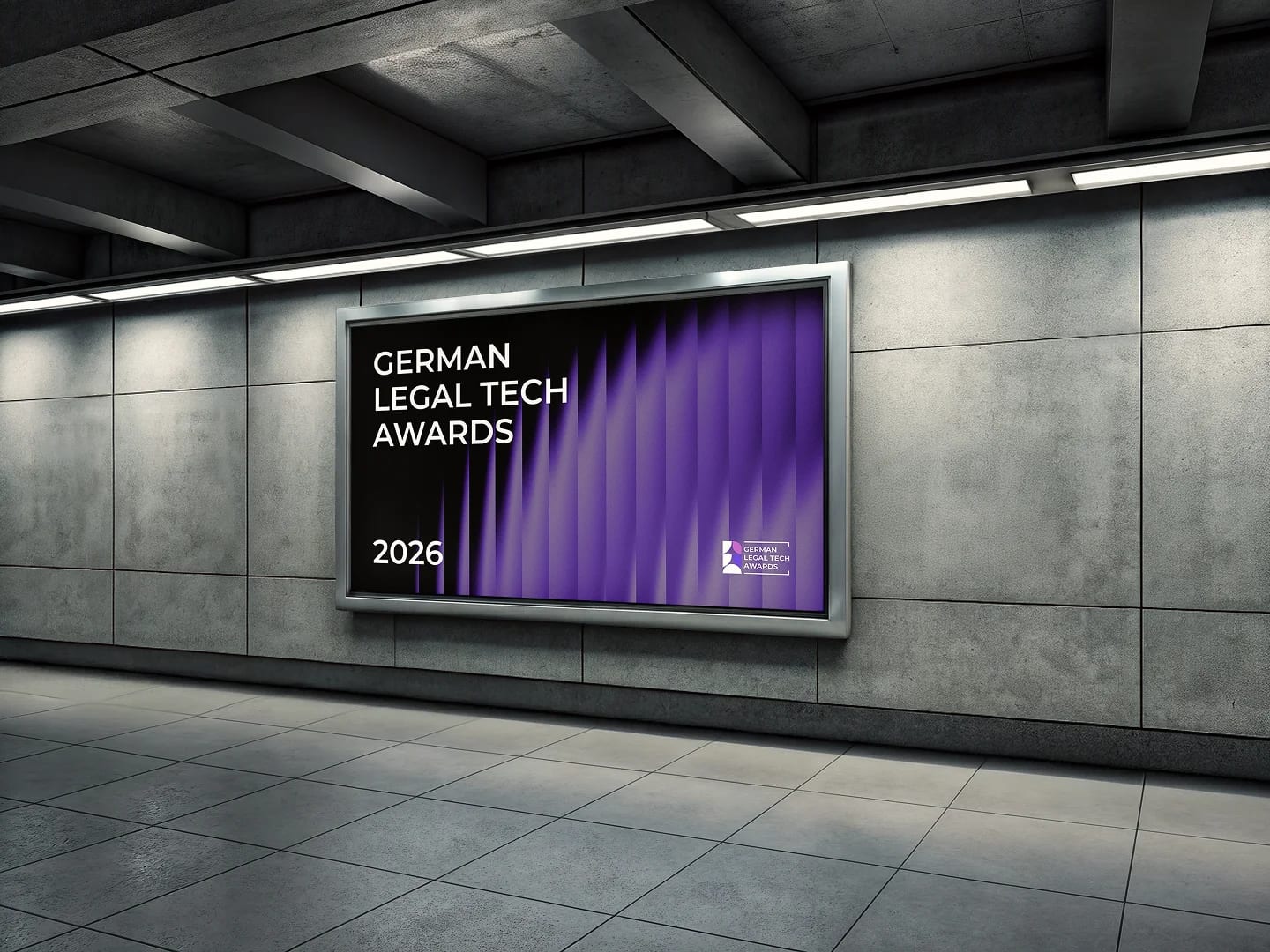
The identity was applied across the whole evening — stage screens and backdrop, badges and lanyards, signage, the printed programme, posters, and table collateral — so the room reads one event rather than a set of separate materials.
Guideline & Handover
Logo versions, the full palette in HEX, CMYK, and Pantone, type rules, and pattern and texture specifications were collected into a single guideline, with mockups of every carrier completing the system. The in-house team can produce the next edition of the awards without us and stay consistent with the identity.
Design System
A small set of choices, applied with discipline.
Primary
Secondary
Palette
Outcome
A complete awards identity that gave Legal Tech Verband a consistent presence across the whole evening — from the stage backdrop to badges, print, and signage — documented so the in-house team can produce the next edition on their own.

Tell us what you're building.
Get a plan back.
We'll reply with a quote, timeline,
and clear next steps.