Project Overview
We collaborated with Keyvents on creating a modern and flexible brand identity for an event agency. The main idea behind the logo mark was to represent the brand proposition — opening a world full of vibrant and inspiring events.
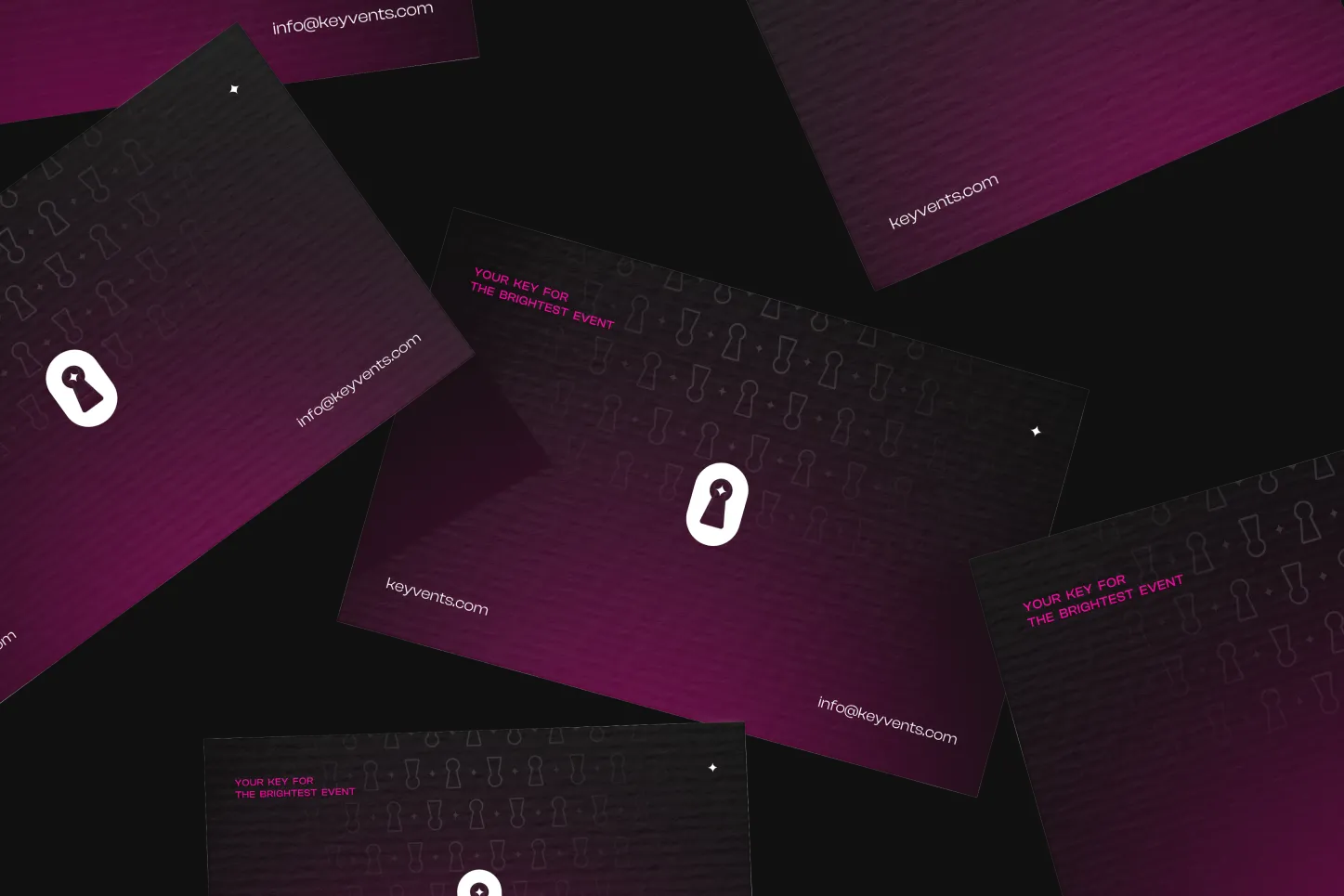
We explored several logo directions, showing how the central keyhole symbol could adapt across different compositions and brand applications, keeping the look dynamic yet consistent across every touchpoint.
Process
From concept to crafted detail.
A look at how the work came together — from early direction to the finished surfaces that ship.
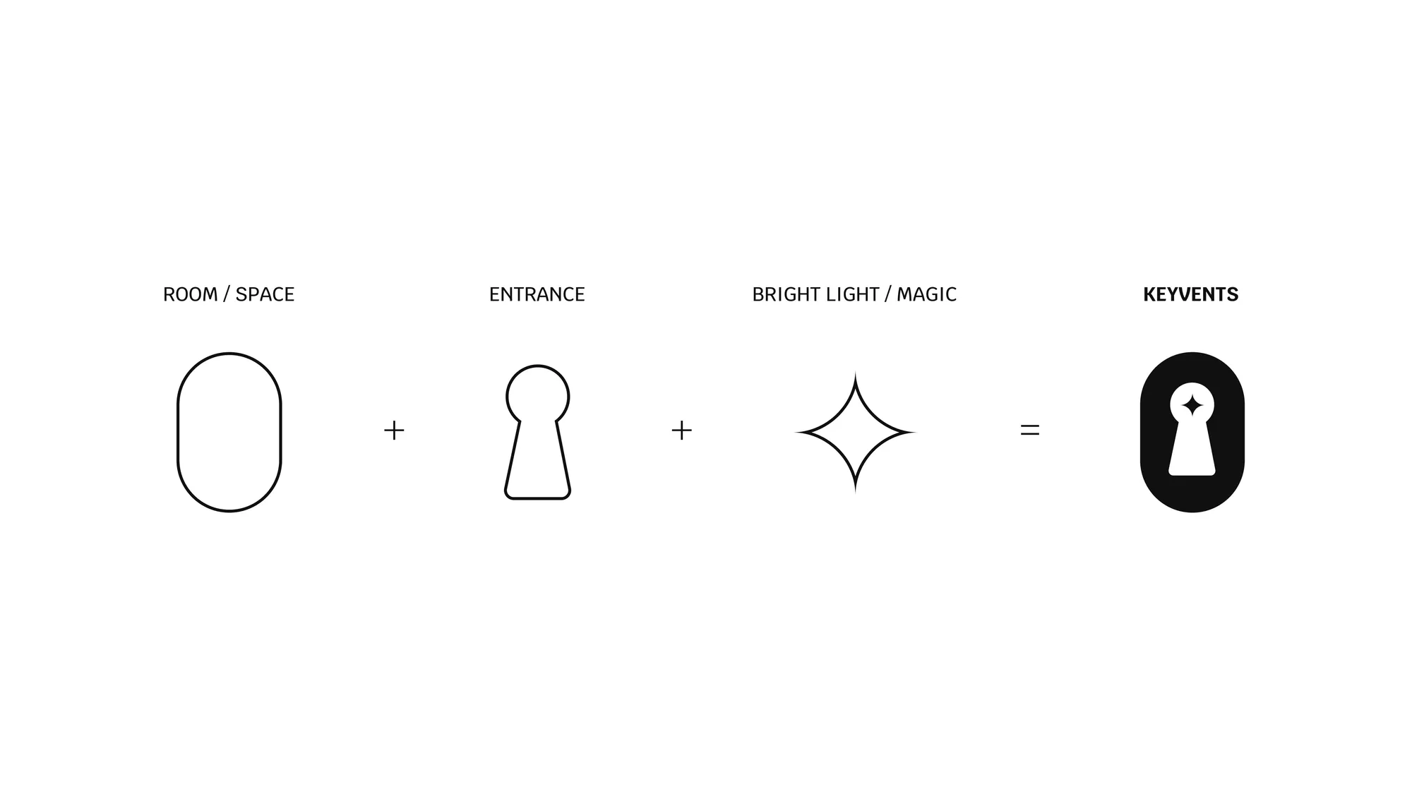
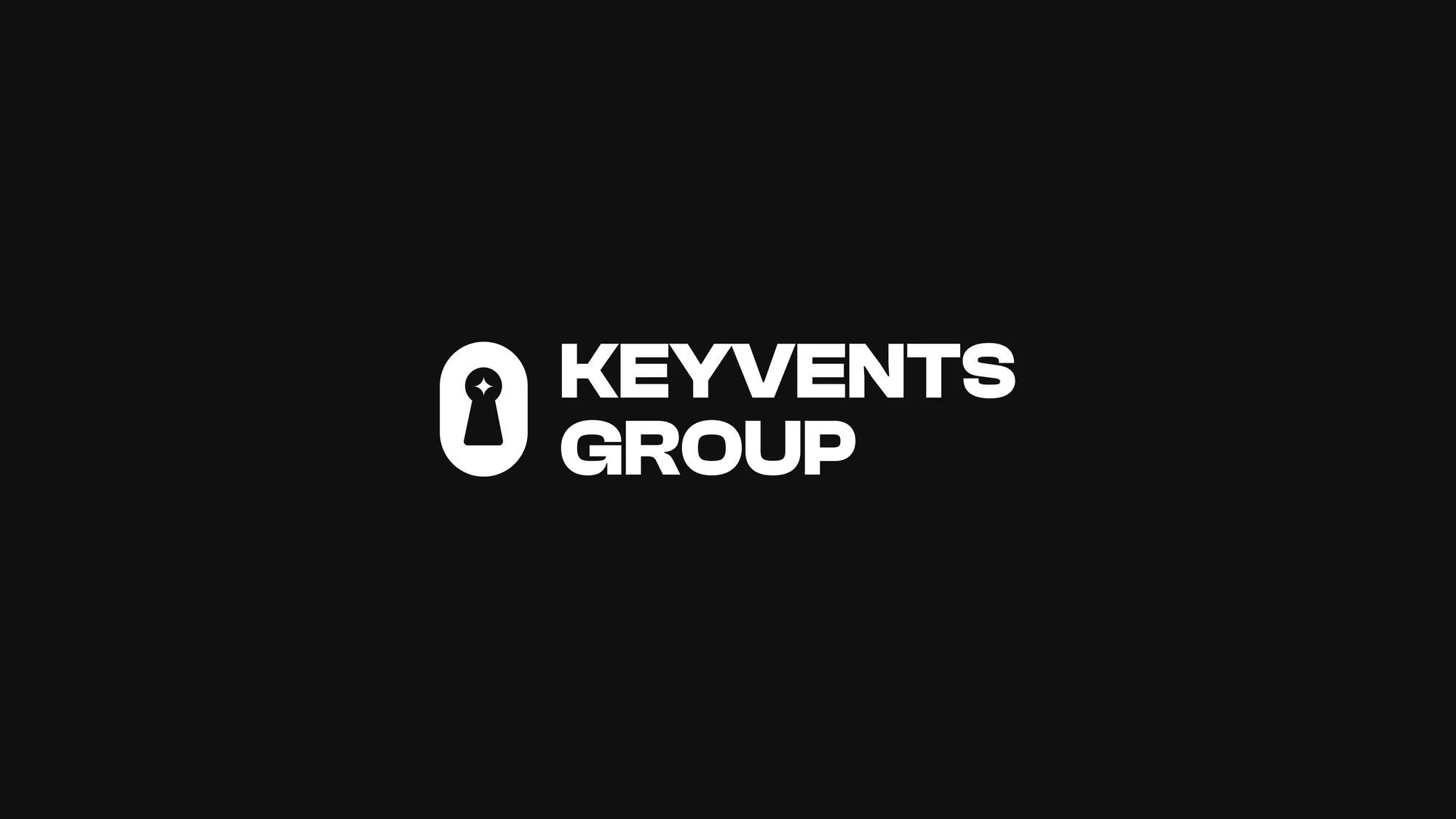
A keyhole that opens the brand
The mark builds from three ideas — room, entrance, and bright light — composed into a single keyhole that signals the moment a guest walks into an experience designed for them.
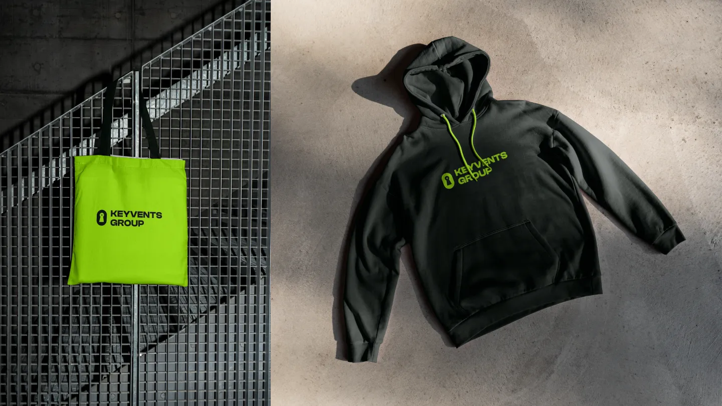
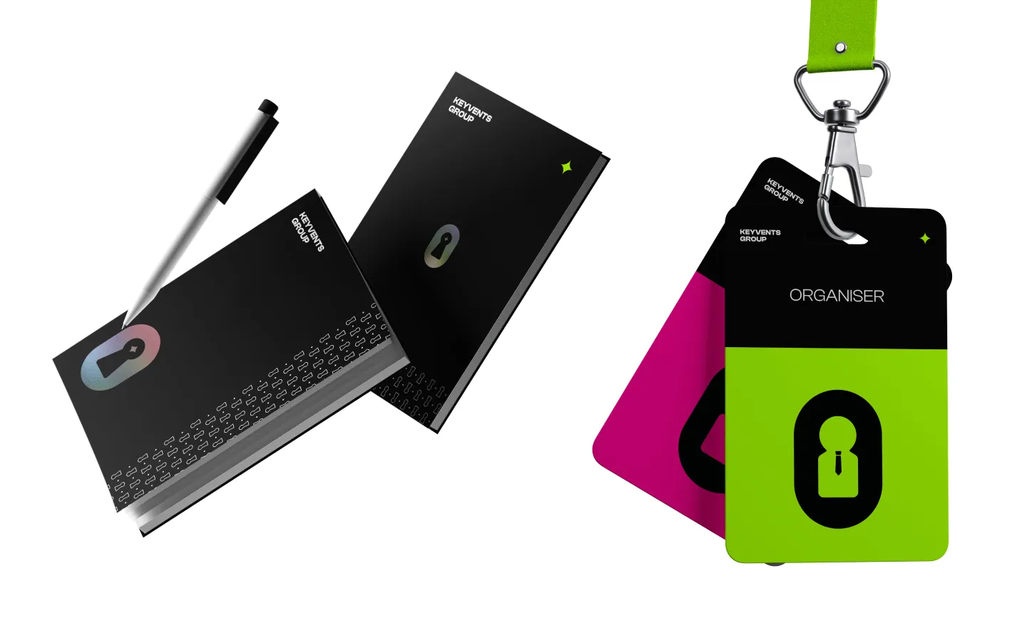
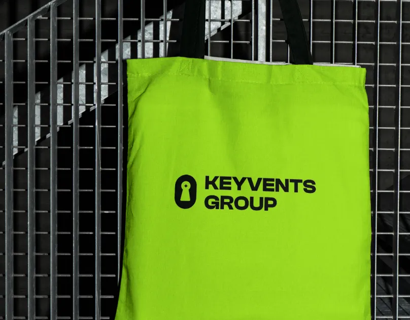
Final logotype, built to travel
After narrowing the direction, we tightened the wordmark and locked the proportions so the mark sits cleanly across signage, social, and event collateral — from intimate dinners to large-scale stages.
A workflow built around the client
Research → identity → sketching → finalization. Each stage included a client checkpoint, so the system that shipped was already pressure-tested against the events the team actually runs.
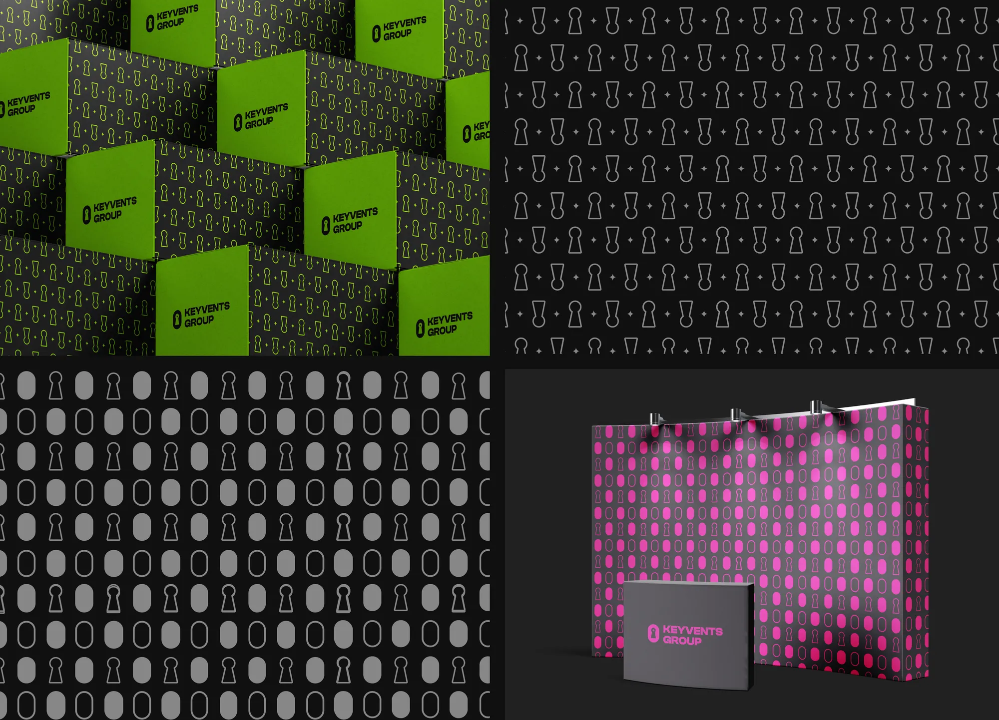
Design System
A small set of choices, applied with discipline.
Outcome
A brand identity that opens the door — flexible enough to dress any event, distinctive enough to be recognized across every surface.
Next project
Want similar
results?
Share your challenge. We'll send back a quote, timeline, and plan.