
po.tours — website for a private travel company
A premium travel website that takes a visitor from a tour idea to a sent trip request, on any screen.
Private journeys deserve an interface that feels just as personal.
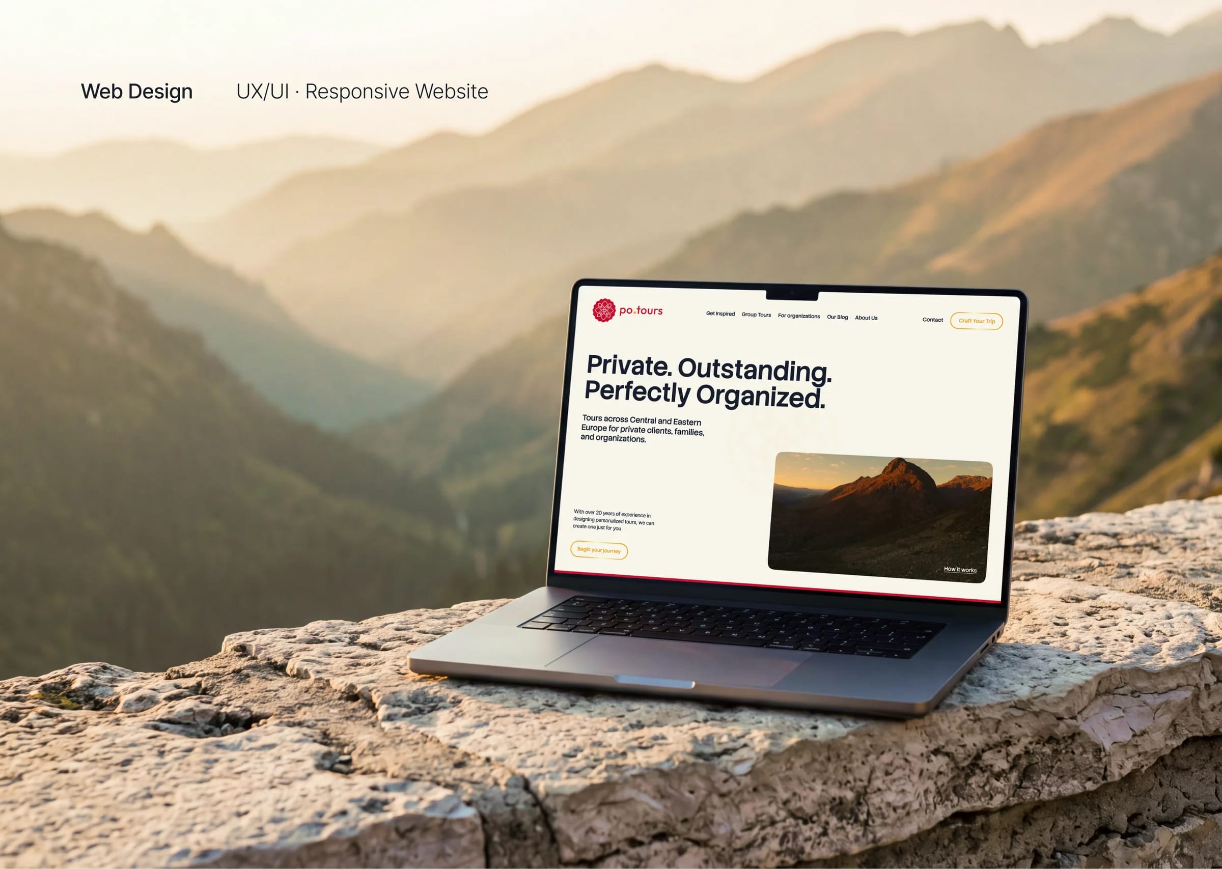
po.tours creates private, fully tailored journeys across Central and Eastern Europe. Behind the brand are more than 20 years of heritage tours in Poland, now open to families, groups and organizations.
The task was to turn a trusted heritage-tour company into a premium travel brand with its own voice. We designed the key pages, from tour inspirations to a trip request form, on one component kit and at two sizes, 1536 and 360 px, ready for handoff.
Process
From concept to crafted detail.
A look at how the work came together — from early direction to the finished surfaces that ship.
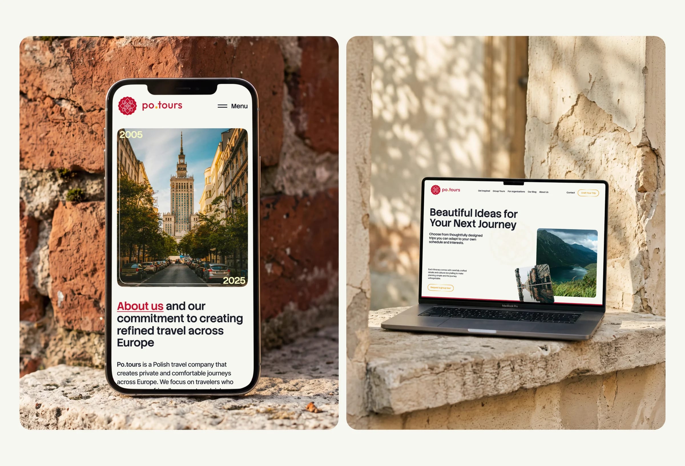
From a heritage-tour company to a travel brand
We started with the sitemap and the paths a visitor takes, from a first idea to a sent request. The visual concept grew out of the brand itself: large photography of real places, a warm off-white base and the signature red of the logo for actions and key words.
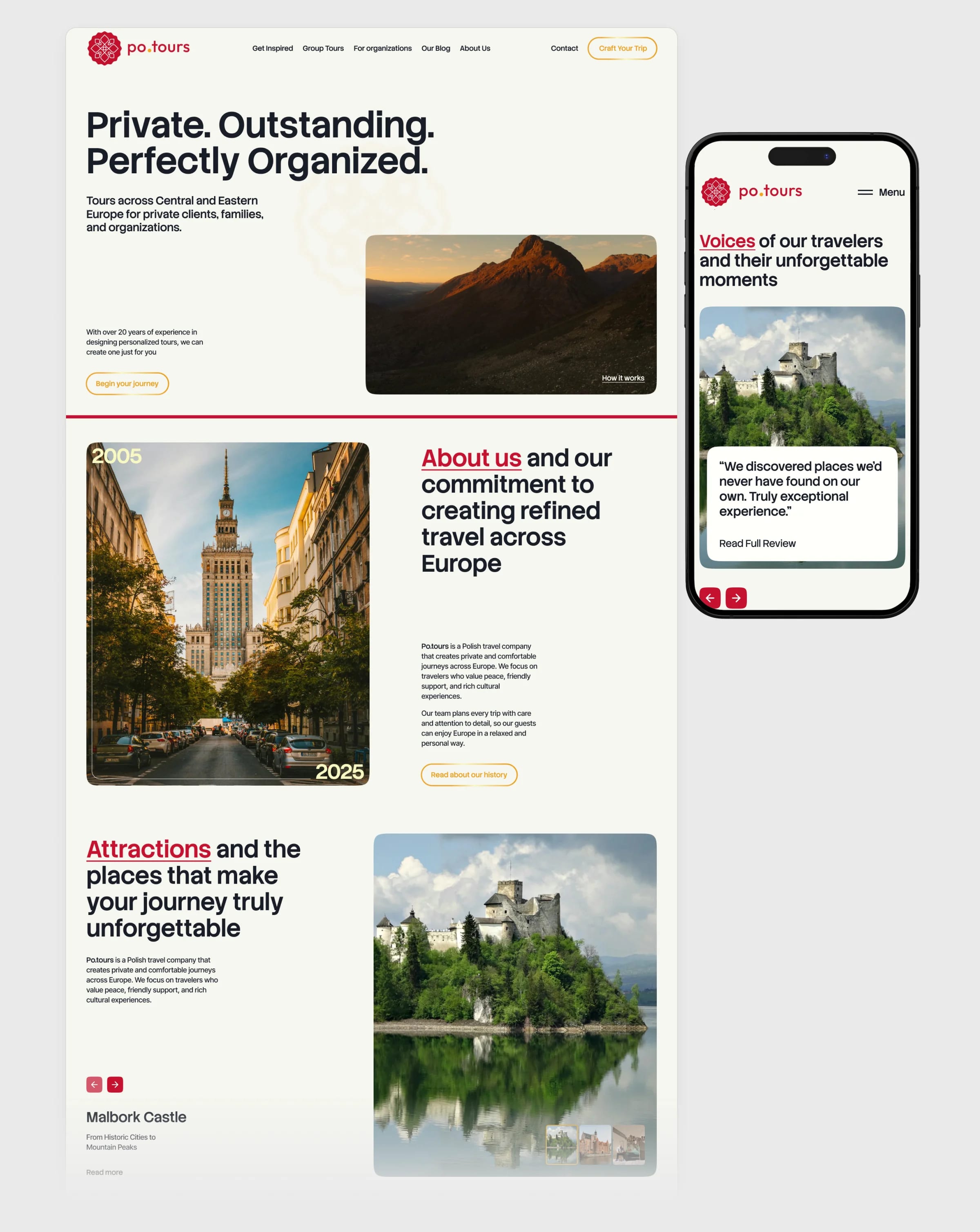
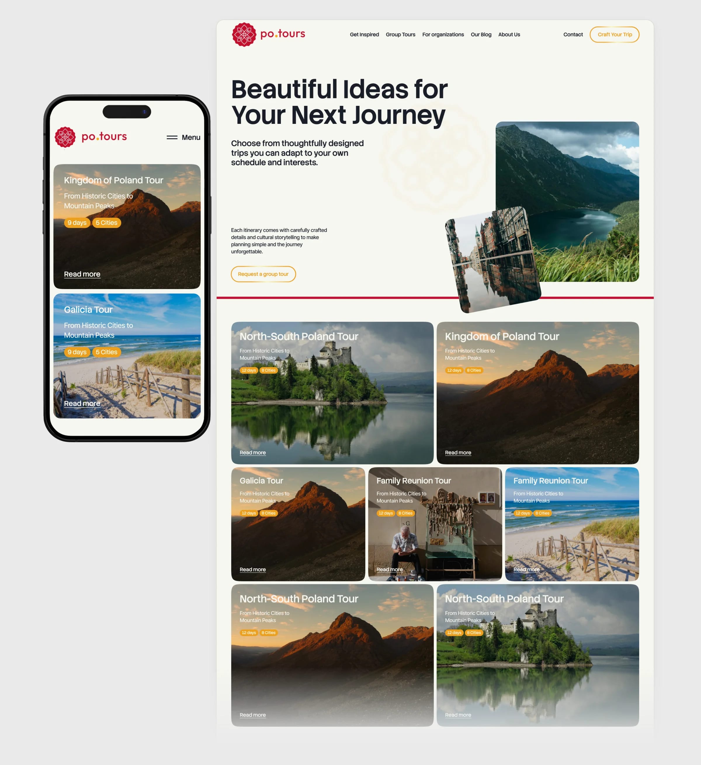
Ideas first, details later
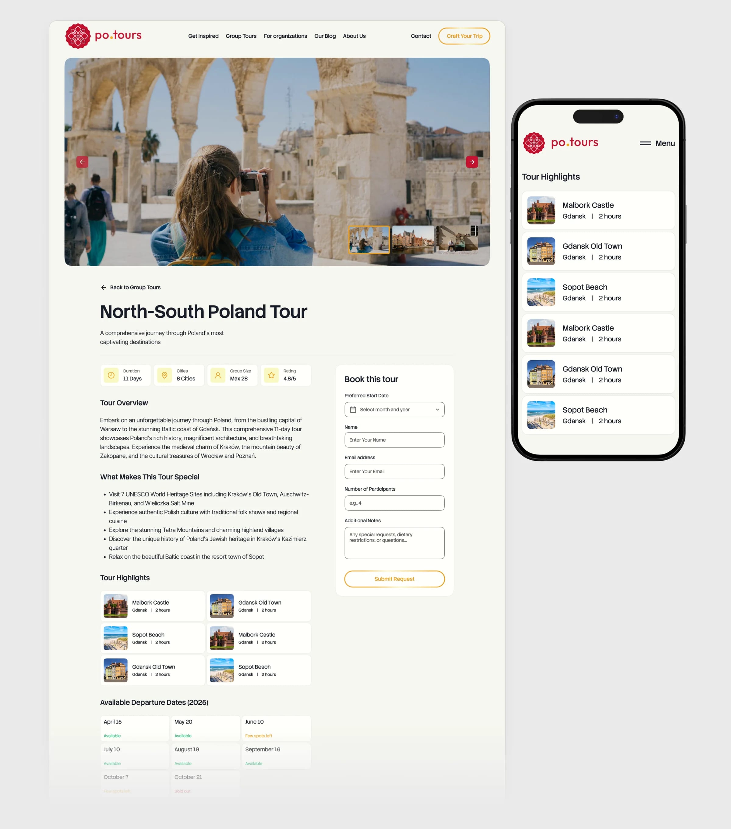
Get Inspired opens with ready itineraries instead of a catalogue. Each tour card shows the route, the number of days and cities, so a visitor can compare trips at a glance and adapt one to their own schedule.
A trip request in a few calm steps
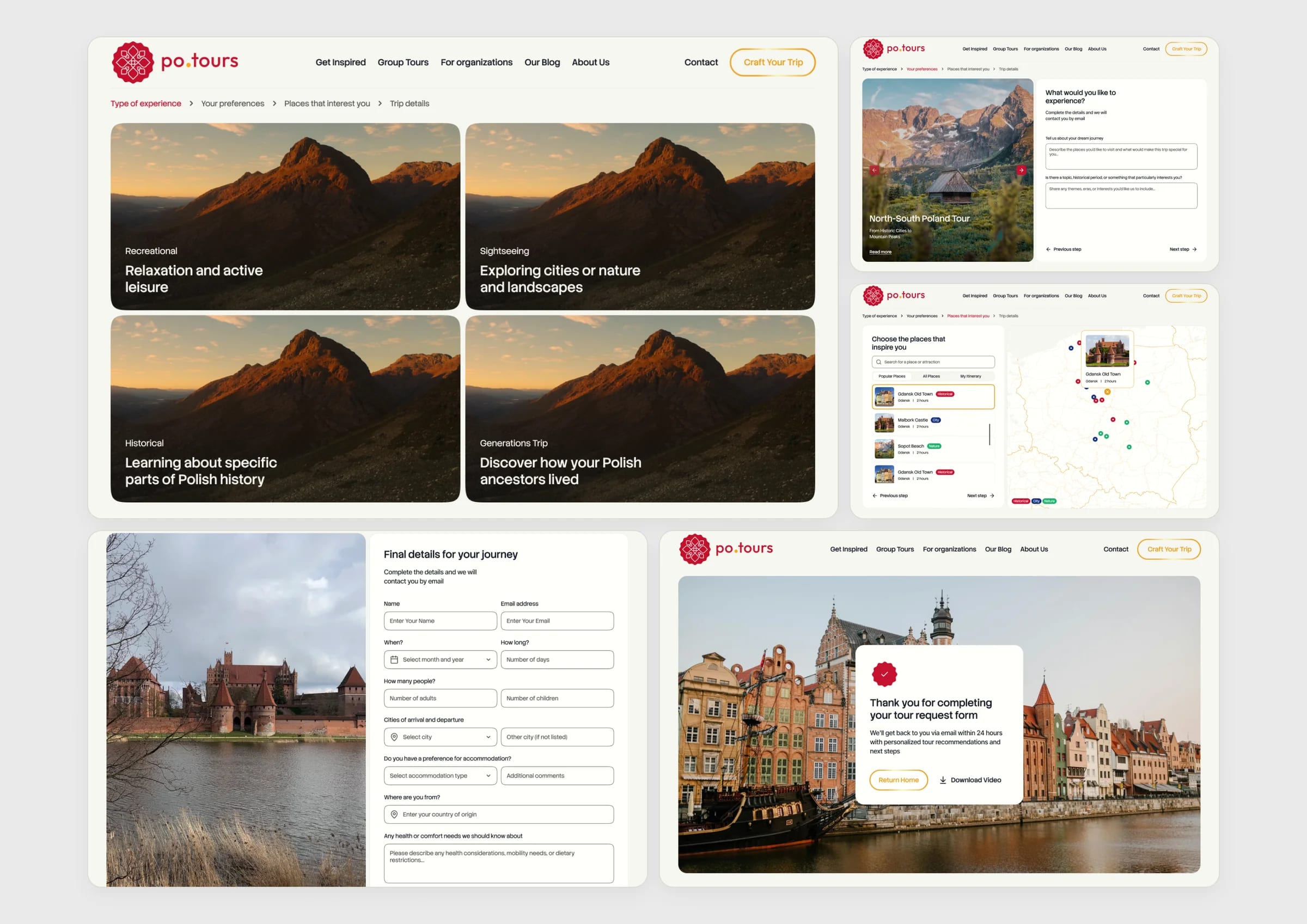
Craft Your Trip replaces one long form with short steps: the type of experience, preferences, places on a map and the final details. Each screen asks one thing, and the last one tells the traveller what happens next.
A separate door for organizations
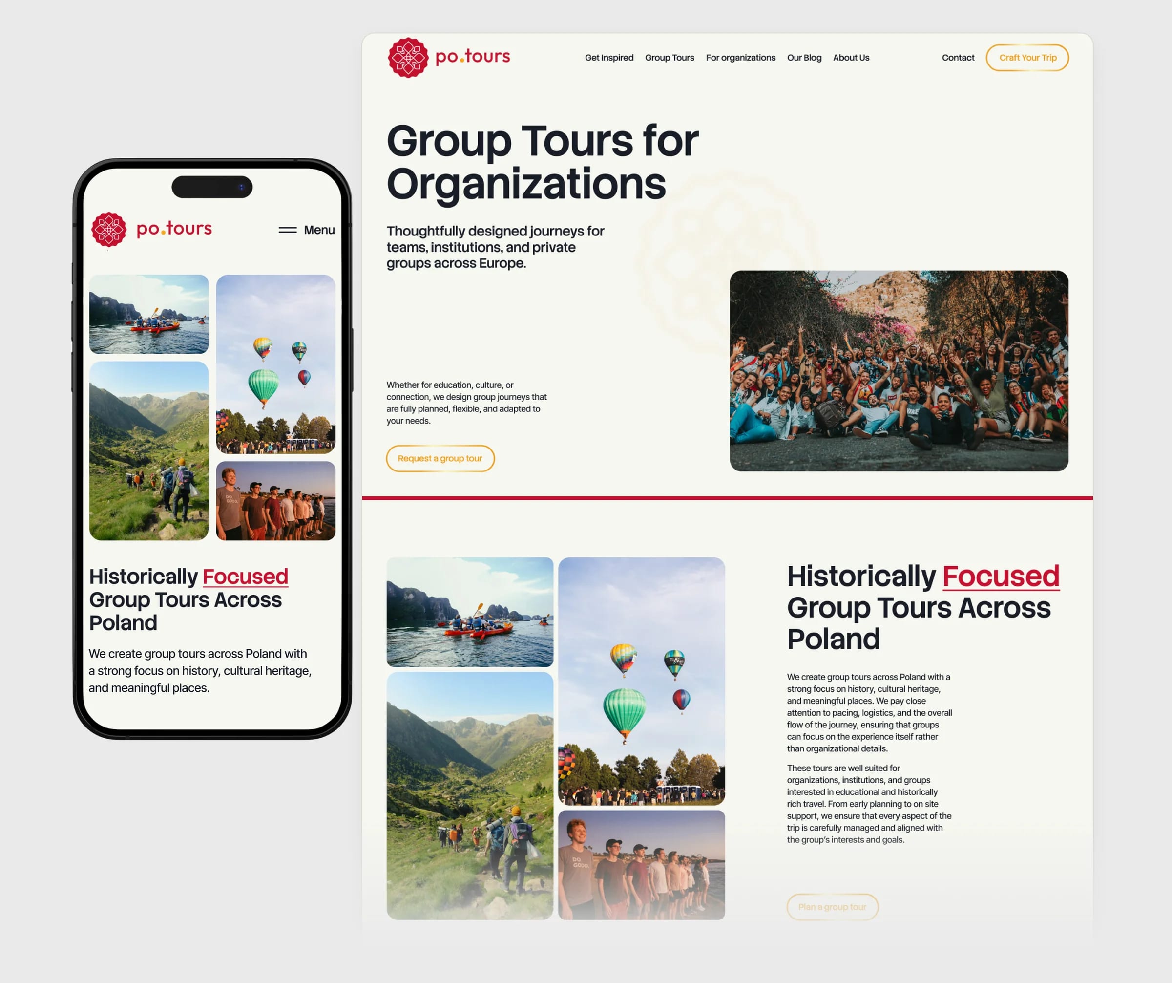
Teams, institutions and private groups plan differently from a family. For Organizations speaks to them directly: group formats, the historical focus of the tours and a request built for a group.
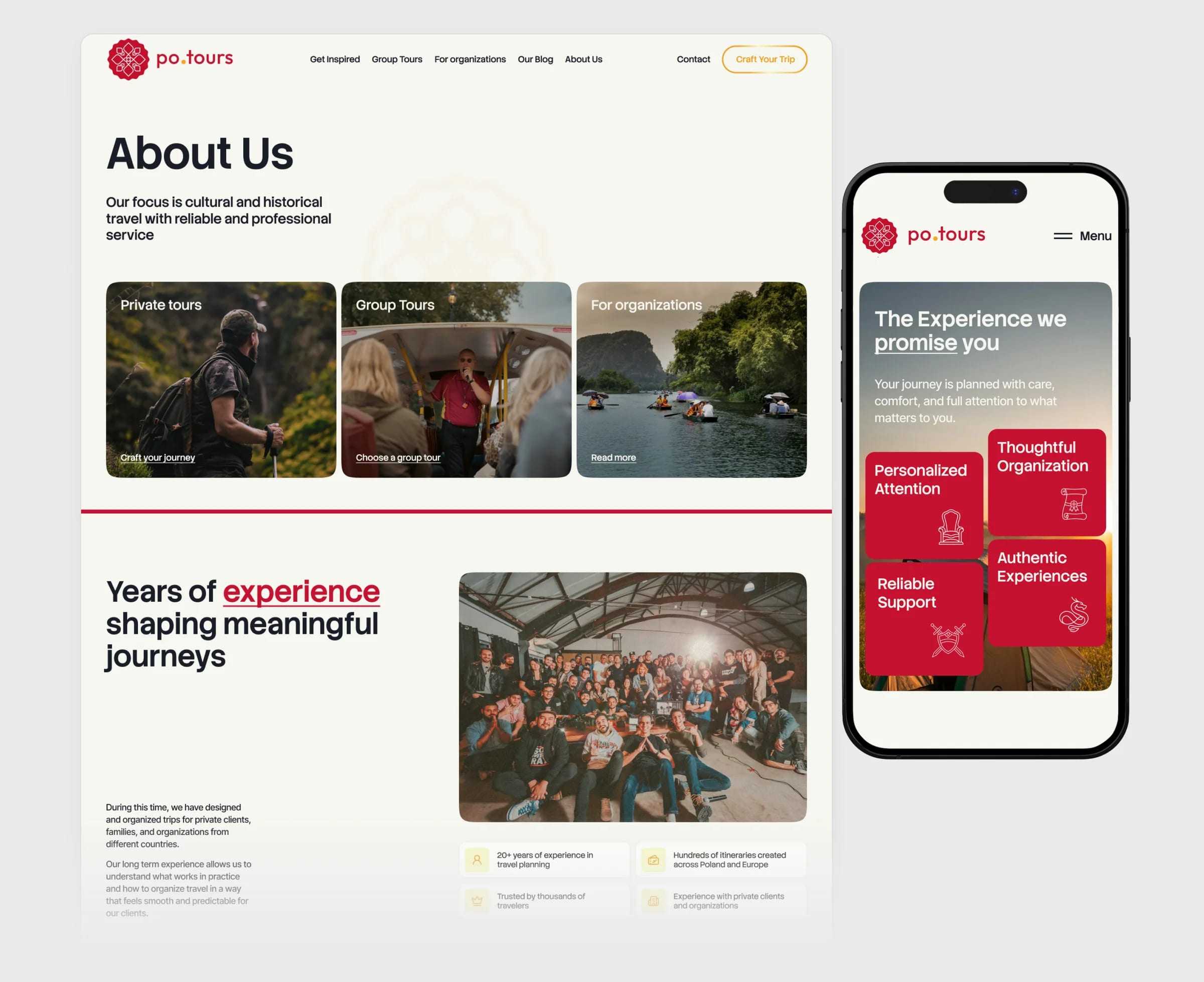
Twenty years, on one page
About Us turns two decades of tours into proof: the story of the company, the experience behind every itinerary and the three ways to travel with po.tours, private, in a group or as an organization.
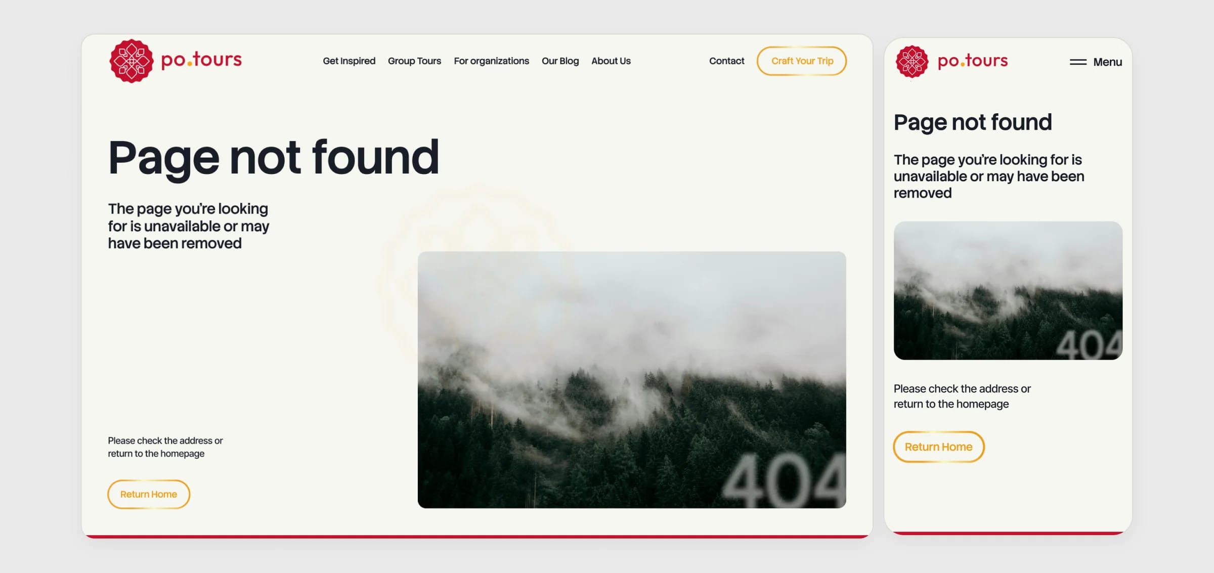
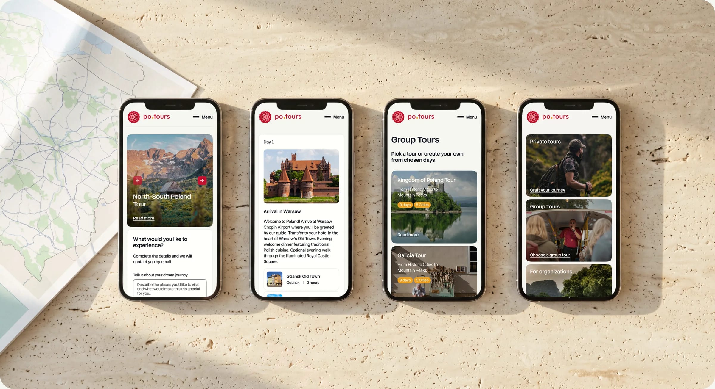
Every page at 360 px
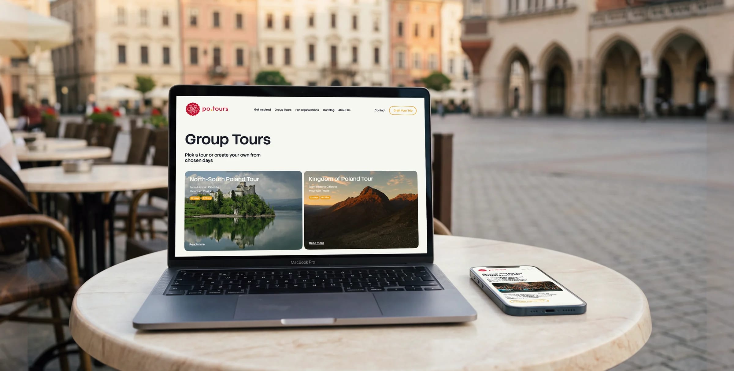
Each of the 16 pages has its own mobile layout instead of a squeezed desktop. Navigation, tour cards and the request form are drawn for a thumb, and the whole set went to development together with the desktop version.
Design System
A small set of choices, applied with discipline.
Primary
Secondary
Palette
Outcome
po.tours now looks as personal as the trips it sells. A traveller can go from an idea to a sent request without a phone call, and the team has one kit to grow the site with.
Tell us what you're building.
Get a plan back.
We'll reply with a quote, timeline,
and clear next steps.