The company profile deck: selling while you are not in the room
It gets forwarded to someone who has never heard of you, opened on a phone, skimmed in ninety seconds. No presenter, no second chance at slide one.


A company profile deck works your worst conditions: forwarded by someone who liked you to someone who has never heard of you, opened on a phone, skimmed in ninety seconds, and judged as evidence of how you work. No presenter, no voiceover, no second chance at the first slide.
Most profile decks are built for the opposite situation — a patient reader who wants the company's full history. That reader does not exist. We rebuild these decks regularly and the fix is almost always the same: less biography, more argument.
It is an argument, not an encyclopedia
The standard failure is the chronological company tour: founded in, grown to, offices in, values are. All true, none of it doing work. The reader's actual question is narrow: can these people solve my problem, and is it safe to talk to them?
A working profile deck answers in a straight line — here is the kind of problem we solve, here is how we work, here is proof, here is what engaging us looks like, here is the next step. Eight to twelve slides. Every slide that does not serve that line — the timeline, the fourth value, the office photos — moves to the appendix or leaves. Tone matters more here than in any other deck, because the deck is the first impression of your judgment: confidence reads as short sentences and specific claims, insecurity reads as adjectives.
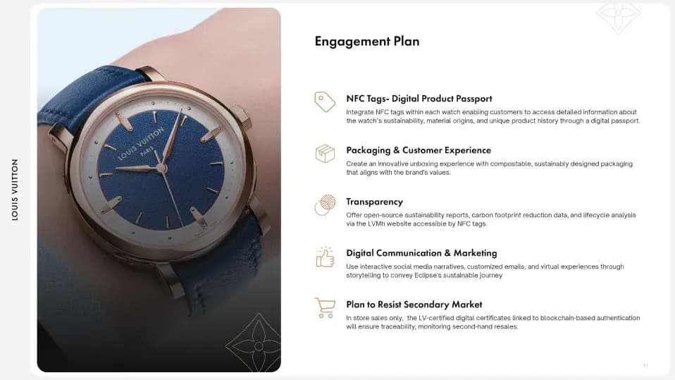
One case per slide, built as proof
Case studies are the load-bearing slides, and they fail when treated as a gallery. A screenshot with a logo says “we have done things”. A case built as proof says: the client, the problem in one sentence, what we did, what changed. One case per slide, so each gets a full argument instead of sharing a grid with five others.
On outcomes, honesty outperforms theatre. If there is a real number, use it. If there is not, a specific qualitative outcome — “the sales team stopped rebuilding the deck for every meeting” — beats an invented percentage, and sophisticated readers smell invented percentages from the second decimal place. We would rather ship three modest true outcomes than five impressive ones nobody can stand behind. The modest version wins more meetings.
Design for the skim, then for the read
A forwarded deck gets two reads: a ninety-second skim that decides whether a real read happens, and maybe the real read. Design for them in that order. Slide titles that state conclusions rather than categories — “We design decks that survive investor scrutiny”, not “Our Services”. One idea per slide. Numbers big enough to land while scrolling. And a visual system consistent enough that slide nine still looks like slide two, because in a profile deck consistency is itself evidence: it is the product you are selling.
The last slide
End on a next step small enough to take today — a link, a contact, a scoped starting offer. “Thank you” is not a next step; it is a dead end with serif type.
Building decks that survive the forward is what our presentation and pitch deck design is for.
Frequently asked questions
How is this different from a sales deck?
A sales deck sells one solution to one buying situation and lives inside a sales process. A profile deck introduces the whole firm to a cold or lukewarm reader. Its job is to earn the meeting where the sales deck gets used.
How long should it be?
Eight to twelve slides in the main line, appendix for the rest. If it needs a table of contents, it has become the encyclopedia again.
How often should it be updated?
Cases every quarter, or the deck starts to smell of last year. A strong argument for building it on a template system, where swapping a case is minutes rather than a project.
PDF or slides?
Both, from one source file. The PDF is what gets forwarded; the editable version is what your team adapts per prospect without breaking the design — assuming it was built to be edited, which is worth specifying when you commission it.
Keep reading
All articles
AI presentation tools vs design agency: what businesses should choose
What we hand to an AI presentation tool without thinking, what we never let it near, and the moment in a room where the difference shows up.
Read article
Why presentation design still wins business in 2026
A deck wins business when it stops a sound argument from being lost in its own delivery. It does not rescue a weak one — and pretending otherwise is how decks get overbought.
Read articleNeed a presentation that
actually lands?
We design pitch decks, investor reports,
and keynote materials that communicate clearly and win the room.