Dashboards as narrative, not noise
The dashboards people actually open read like editorial: a headline, a paragraph, an argument. The ones nobody opens tried to show everything.


Ask a leadership team which dashboard they open on Monday morning and you usually get one answer, sometimes none — even at companies running fifteen of them. The other fourteen were built to cover everything, and covering everything is how a dashboard becomes furniture.
The ones that survive read like editorial writing. The first screen is a headline, each chart is a paragraph, and the order is the argument. That is a lens rather than the full method — the complete checklist is in what makes a good dashboard — but it earns its place, because bad dashboards fail exactly the way bad writing fails: trying to say everything at once.
The first screen is the headline
A newspaper reader does not need the whole article to know whether a story matters to them. A dashboard owes the same courtesy. The first viewport should answer “is everything okay” before it answers anything else — the one or two numbers that say relax or look closer. Everything more detailed is body text, and body text can wait for the reader who scrolls.
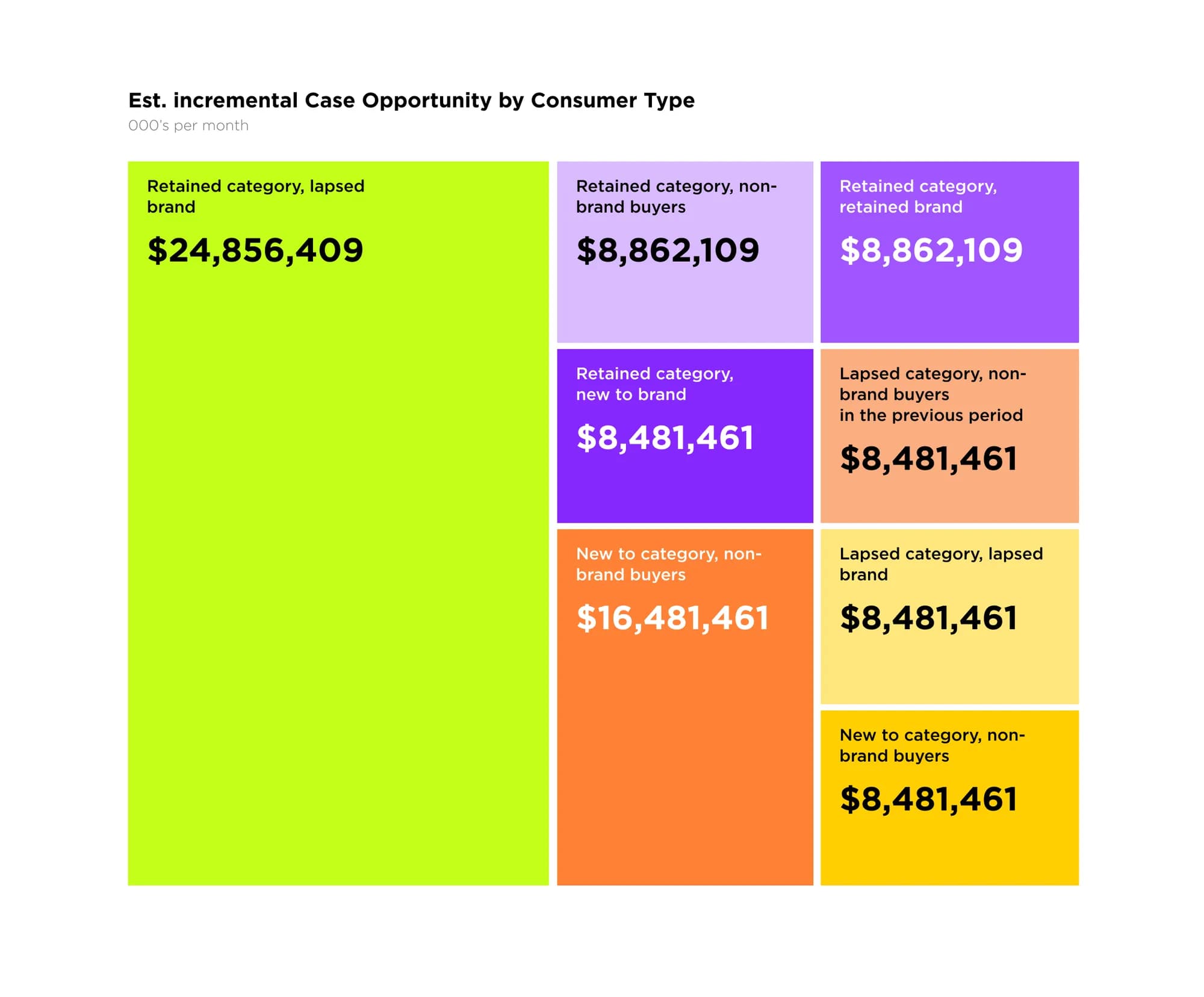
Every chart should imply a verb
In writing, a sentence that states nothing gets cut. A chart earns its place the same way — by implying an action. Read it and you should know whether to investigate, escalate or ignore. Four rules cover most of it.
- Each chart implies an action: investigate, escalate or ignore.
- Anomalies go above the fold; stable signals go below it.
- A filter earns its place only if it gets used more than once a week.
- A dashboard with no opinion is a dashboard nobody reads.
The sharpest framing we have found is one sentence: a good dashboard decides what goes on the cover, what gets buried inside, and what is left out entirely. Coverage is not the goal — comprehension is. Every extra chart is a tax on the reader, worth paying only when it answers a question that has already cost the team time.
The test
If you cannot say in one sentence what a chart is for, it is not for anything. Remove it, or restate it until the sentence appears.
Where the metaphor breaks
A story has one author deciding what the reader sees. An analyst's tool is the opposite — it exists so the reader can ask their own questions and follow a hunch nobody anticipated. There, narrative framing gets in the way: the density an executive would call clutter is exactly the workspace an analyst needs. So the metaphor holds for a dashboard meant to be read and loosens for one meant to be interrogated. Which one you are building is worth settling before anyone opens a canvas — we draw that line in dashboards for executives vs analysts.
The dashboards that earn a place in someone's morning are written like good editorials: a clear lead, a defensible argument, and the discipline to stop once the point is made. Building them is the centre of our dashboards and data design.
Frequently asked questions
What does “dashboards as narrative” mean?
Designing an analytics interface to answer a question and lead to a decision, rather than stacking every available chart on one screen. The layout tells a story: here is the state, here is what changed, here is what to look at.
How do I stop a dashboard from becoming noise?
Start from the decision it should support, not the data you have. Cut metrics that change no decision, group what belongs together, and give the number that matters the most visual weight.
When is the narrative approach the wrong one?
When the reader is an analyst who came to interrogate the data, not to be told a story. An exploratory tool needs density, filters and freedom to slice — the opposite of an edited-down executive view.
Keep reading
All articles
What makes a good analytics dashboard — and what quietly ruins one
It fails one well-meaning addition at a time. Here is what a dashboard is actually for, and the six habits that quietly turn one into wallpaper.
Read article
Designing dashboards for executives vs analysts
One reader decides whether to act; the other needs to know why. Build one screen for both and you get a dashboard people screenshot instead of open.
Read articleNeed data that
drives decisions?
We design KPI dashboards and data products that surface what matters and let your team act fast.