Power BI — dashboard for executive decisions
A dashboard system built for readability, eye-safe contrast, and faster executive decision-making.
Project Overview
We were providing support with design and creation of an interactive Power BI Dashboard. The idea was to make the way C-level managers get meaningful and impactful results more efficient across the company.
First priority for every dashboard was readability and a data-centric approach. Super contrast on the key values and figures was crucial to achieve efficient data readability for every user. Proper color use was equally important — we assumed teams would be reading data regularly, and it had to stay safe for their eyes.
Process
From concept to crafted detail.
A look at how the work came together — from early direction to the finished surfaces that ship.
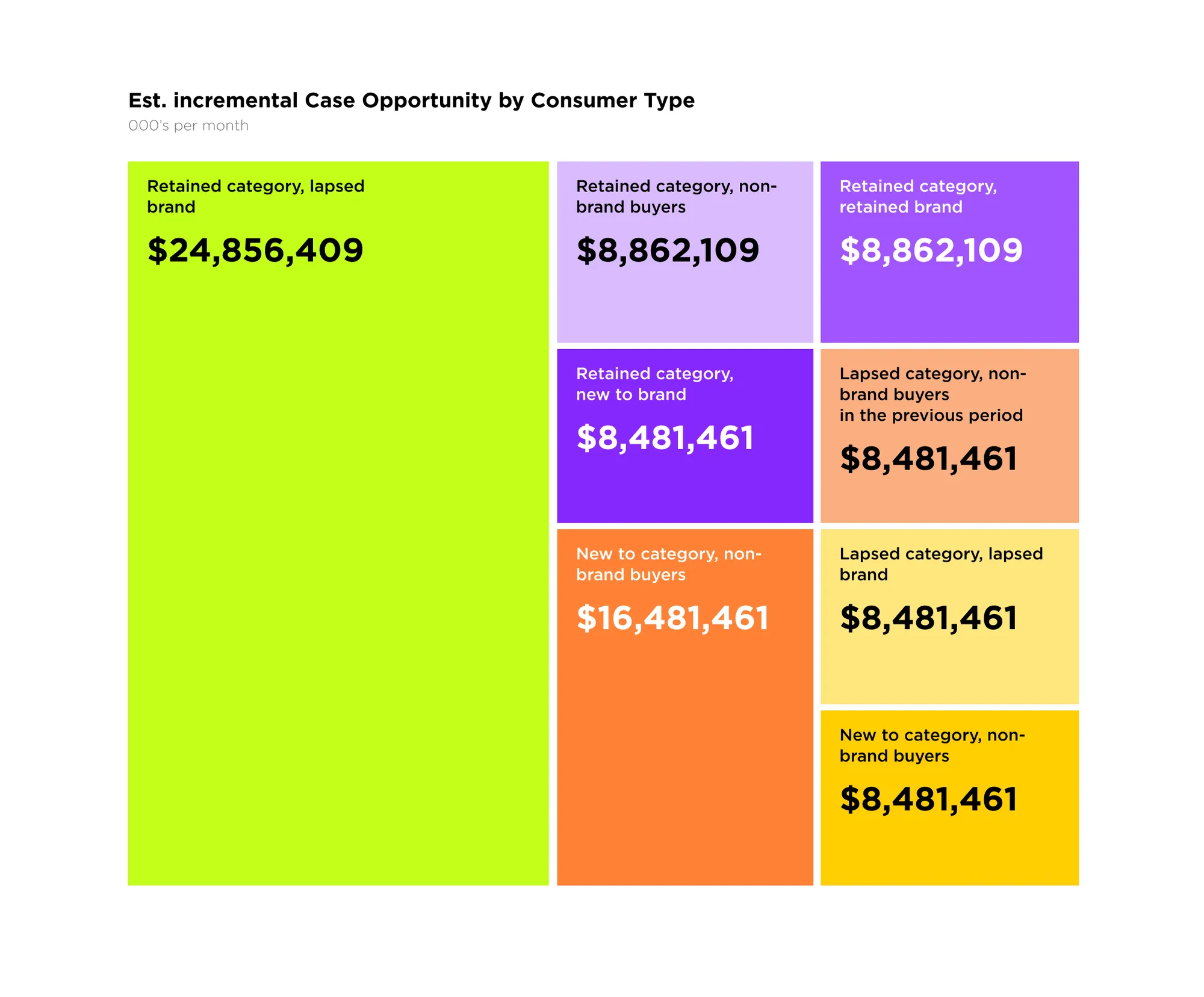
Color-coded opportunity at a glance
A treemap built around a deliberately bold palette lets executives compare incremental opportunity by consumer type in seconds — high-contrast values keep the biggest numbers unmissable.
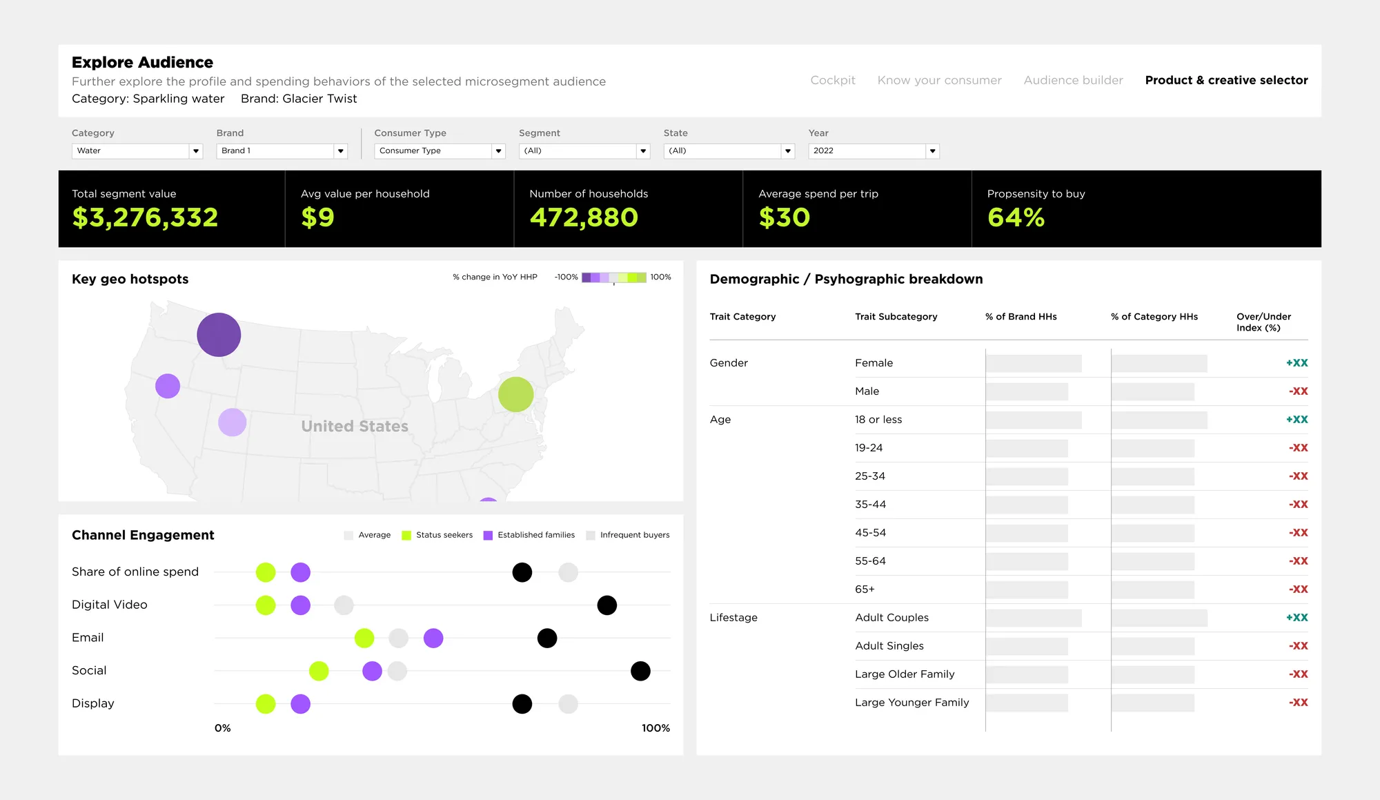
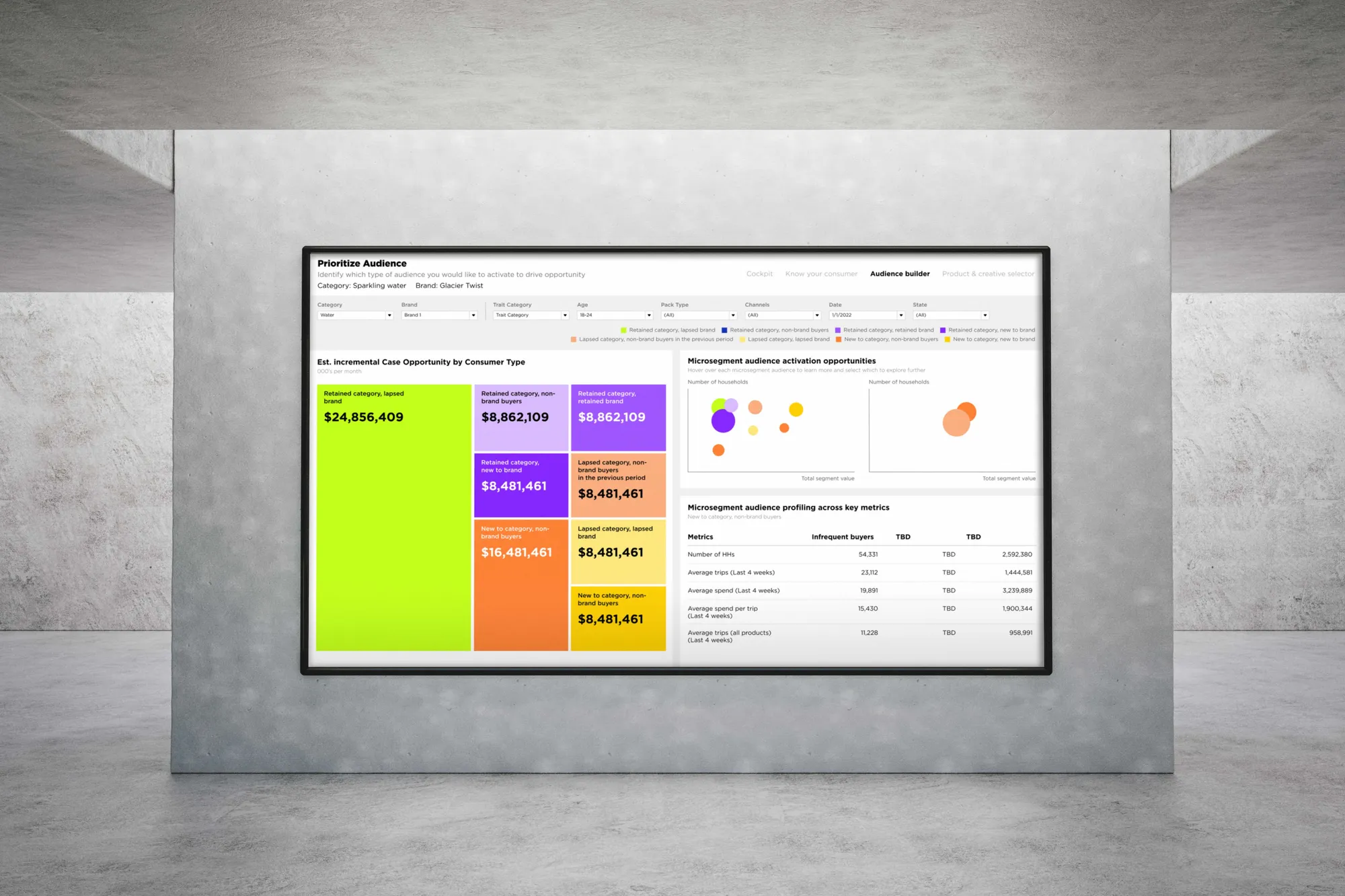
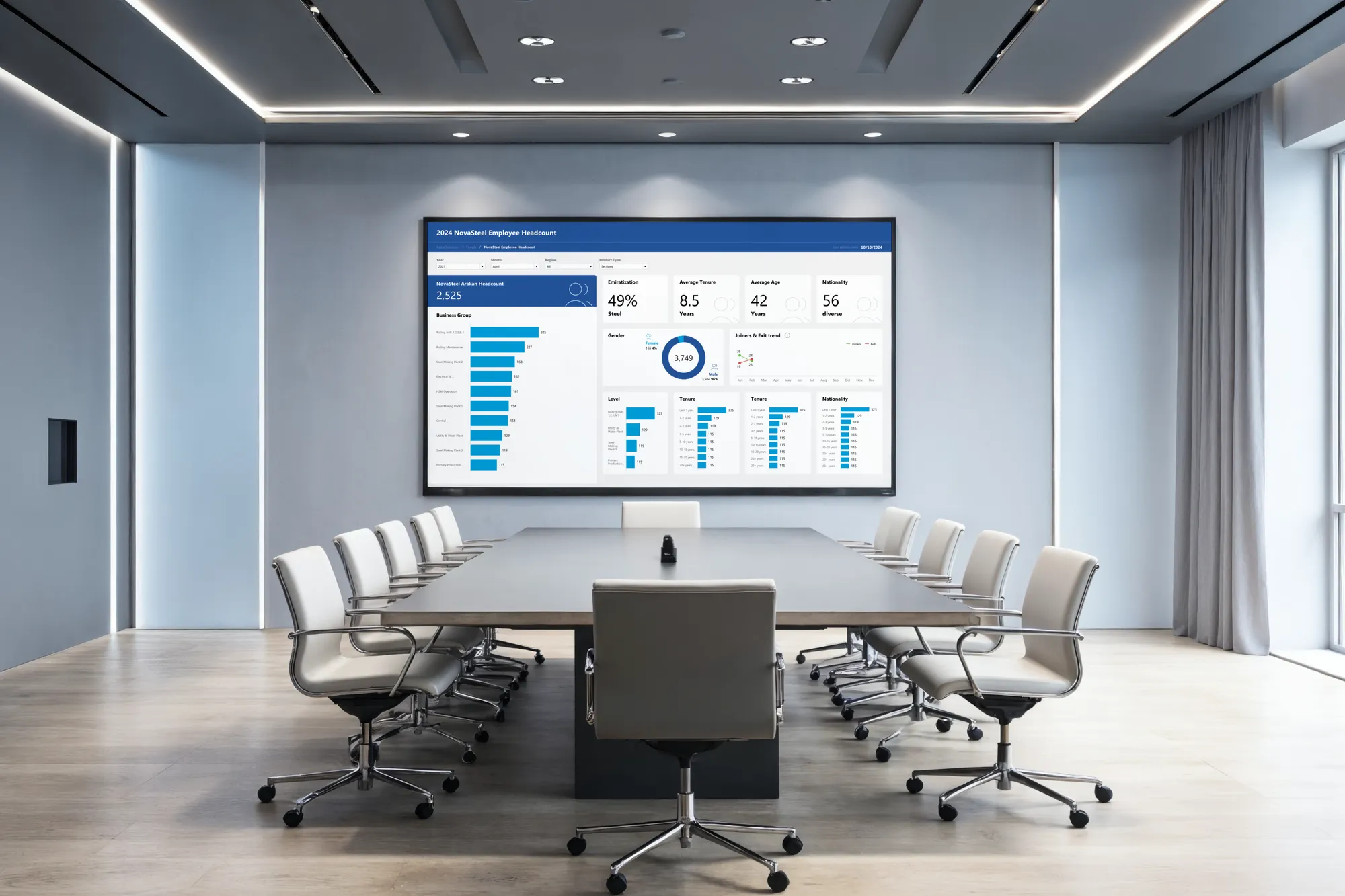
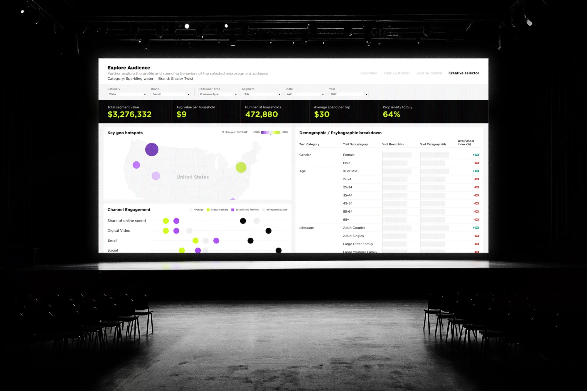
Built to be read across the room
Layouts were tuned for large-format displays in boardrooms — clear filter chips, persistent KPI strip, and accessible color choices that hold up under projection and long reading sessions.
Design System
A small set of choices, applied with discipline.
Outcome
A dashboard system that reads clearly, scales across teams, and lets decision-makers spend less time hunting for numbers and more time acting on them.
Next project
Want similar
results?
Share your challenge. We'll send back a quote, timeline, and plan.