About the task
CoreHouse is a chain of coffee shops born out of the idea to create a space for people living in the rhythm of a modern city, but looking for a moment of silence, taste and real communication. Coffee is not just a drink, but the heart — the core — around which the atmosphere of the house is built.
Our task was to provide CoreHouse with a solid visual foundation: a comprehensive Brand Guideline covering logo safe zones, typography, color palettes, and social media layouts. The toolkit lets the brand carry its philosophy of city balance and heartfelt conversation into every single application — professional, consistent, and unmistakably home.
Process
From concept to crafted detail.
A look at how the work came together — from early direction to the finished surfaces that ship.
Part 1 — Research
We started by listening to the city. Analysing its rhythm, picking the associations a coffee shop should carry, composing moodboards, and checking each step with the client — building consensus before a single mark went down.
Part 2 — Identity
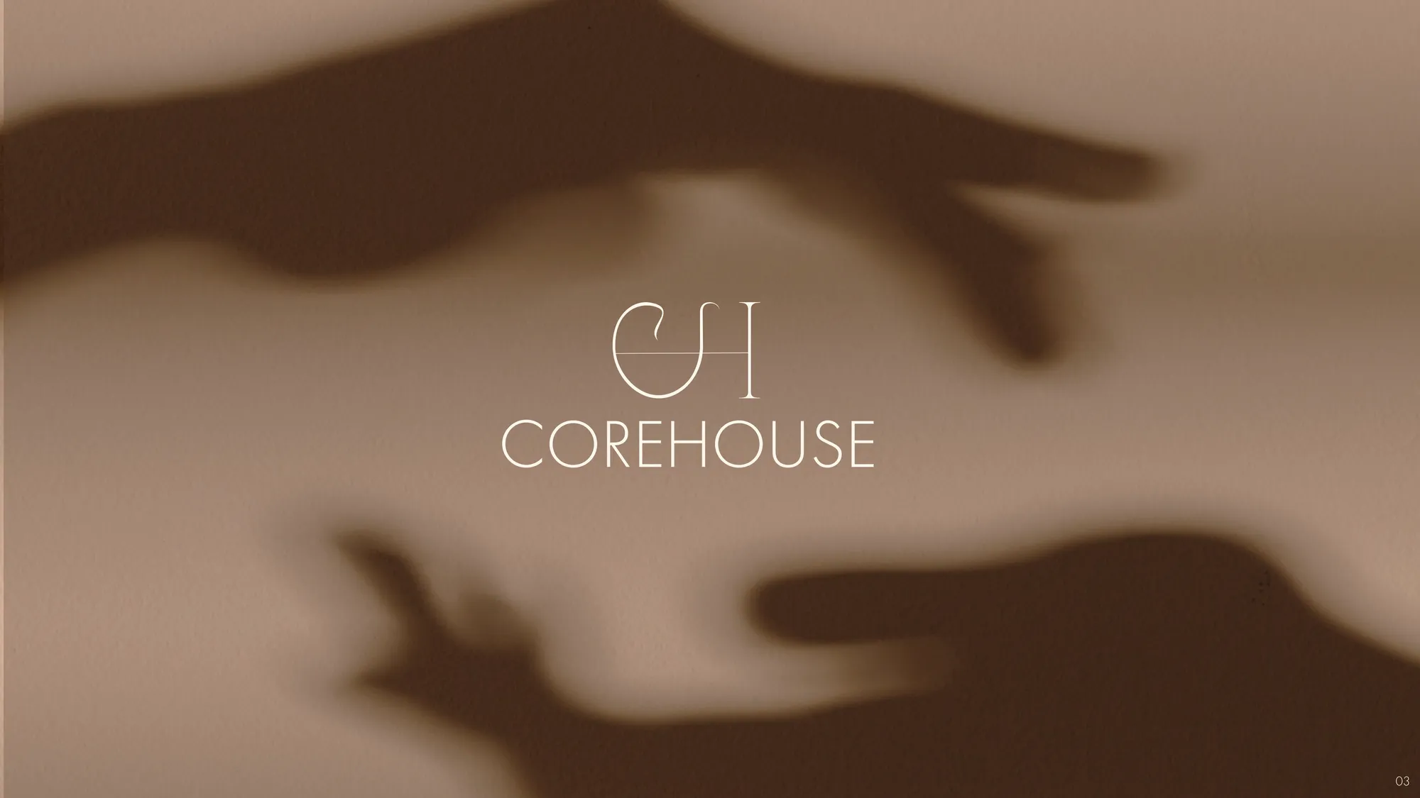
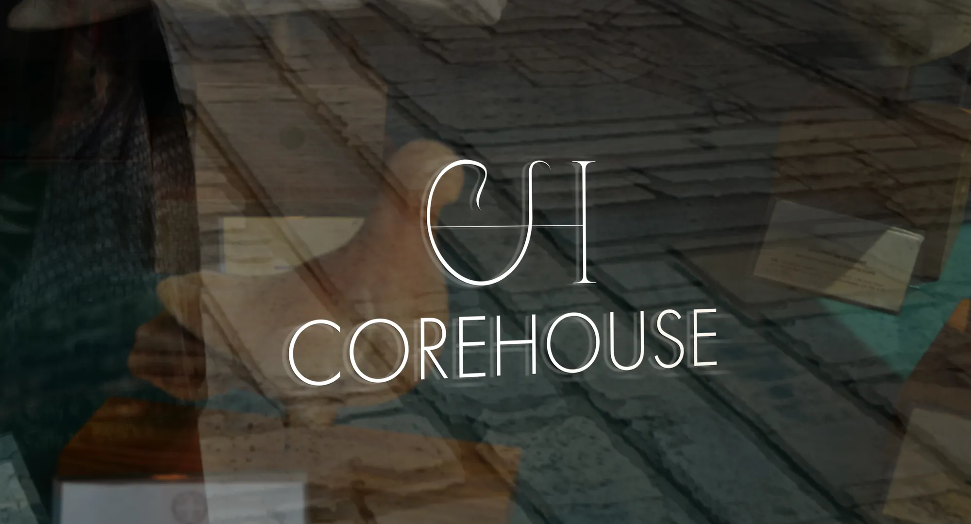
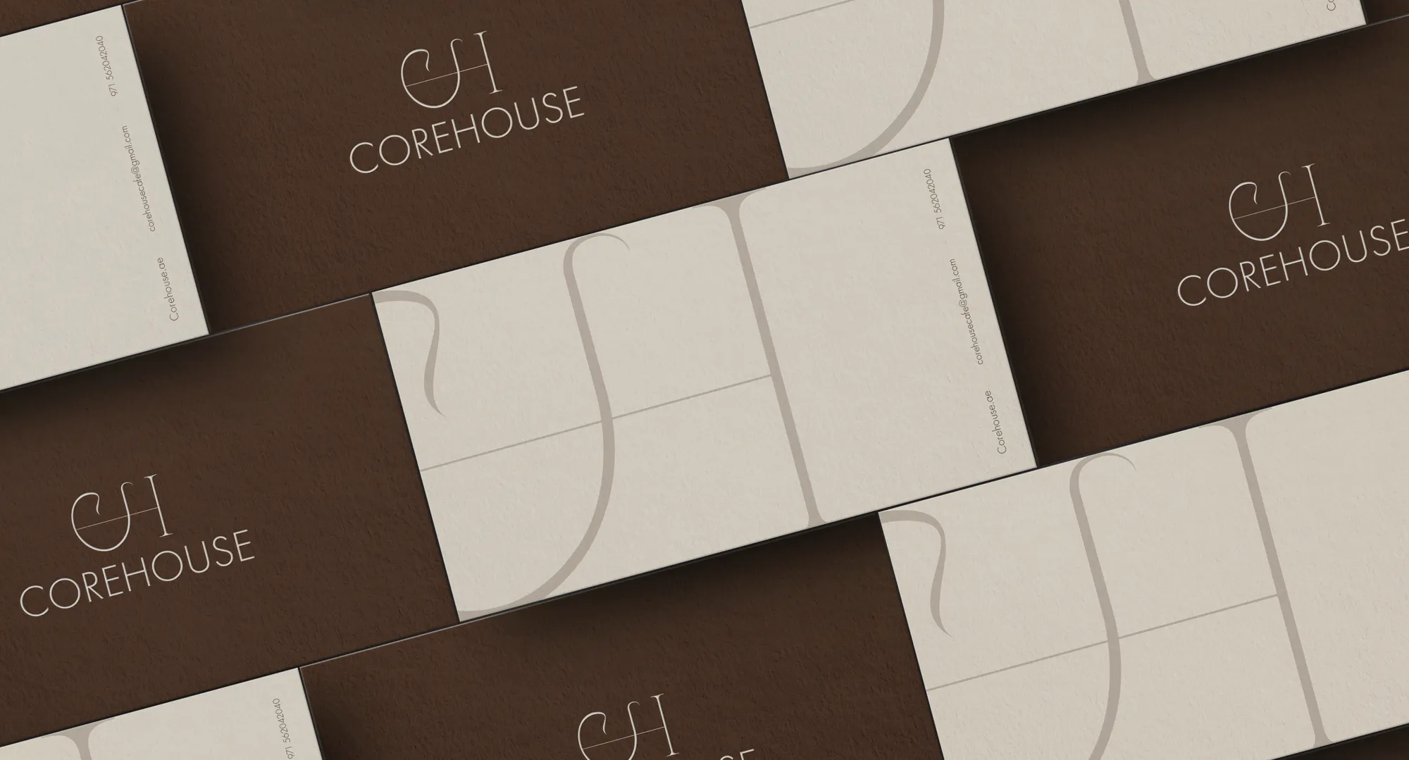
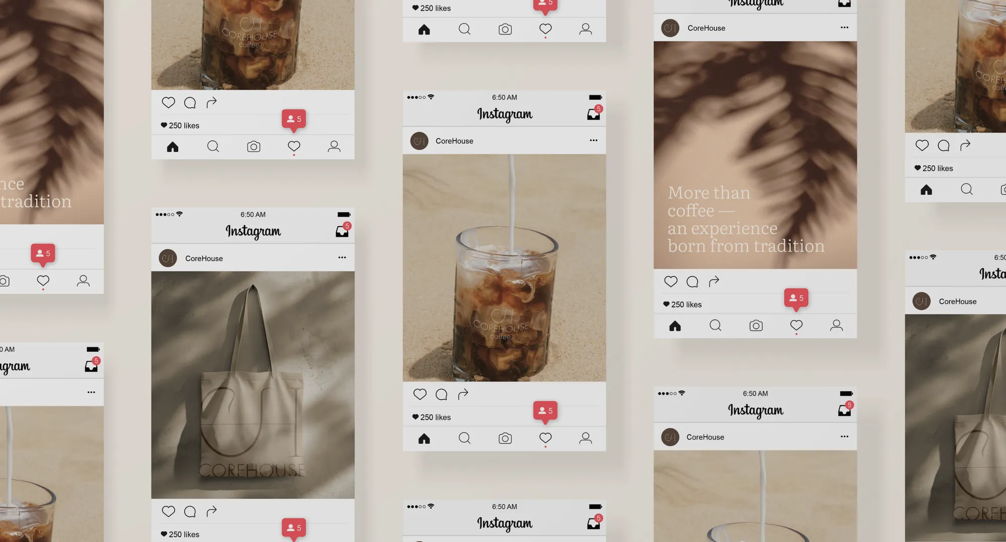
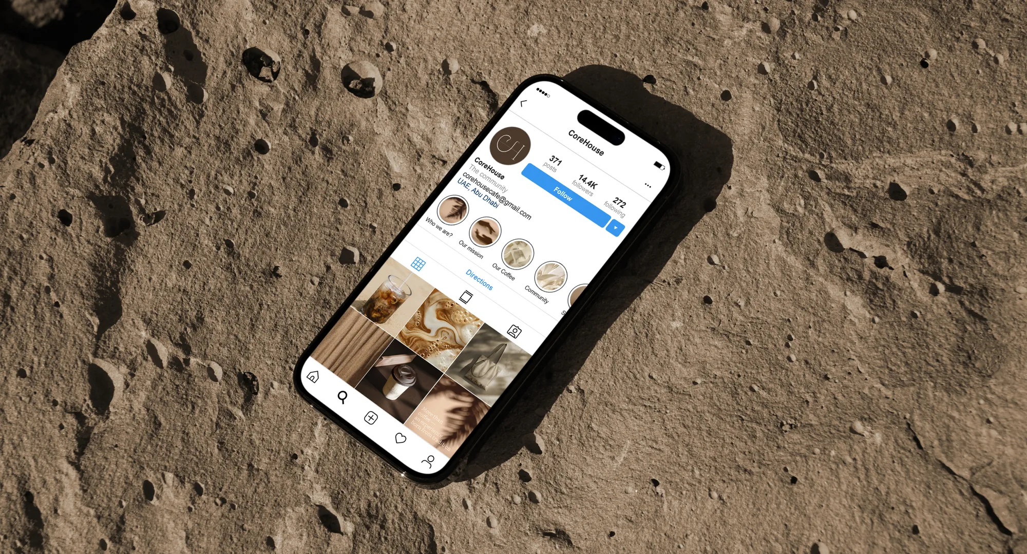
Then the foundations. Defining the color palette, choosing typography, formalising the "core" symbol that gives the brand its name, and writing the SMM rules so the system travels intact onto every social surface.
Part 3 — Design
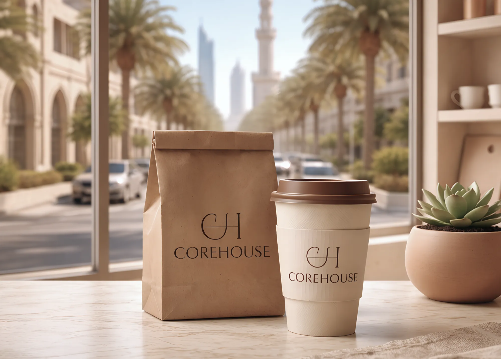
With the system locked, we put it to work — fixing logo usage rules, designing the coffee cups, creating supporting patterns, and applying the identity across realistic mockups so the client could see it in the world before it shipped.
Part 4 — Delivery
We closed by writing it down. Forming the guideline, finalizing every layout, presenting the system in full, and handing it over so the in-house team could carry the brand forward without us.
Design System
A small set of choices, applied with discipline.
Outcome
A complete brand foundation — a guideline the team can apply on day one and the brand can grow into for years, without losing the balance between city energy and quiet conversation.
Next project
Want similar
results?
Share your challenge. We'll send back a quote, timeline, and plan.