How much does dashboard design cost in 2026?
$500 for a restyle, $1,500 to $5,000 for a designed dashboard, $5,000+ for a BI system. What changes between the tiers is not the polish.


Restyling an existing Power BI or Tableau report runs $500 to $1,500. A custom-designed dashboard — layout, hierarchy and chart system built around actual decisions — runs $1,500 to $5,000. A BI design system that standardises every report your company produces starts around $5,000 and climbs past $10,000.
Those are the 2026 numbers. As with most design pricing, the interesting part is what changes between the tiers, because it is not the polish.
$500 to $1,500 — the restyle
Your dashboard already exists and already works; it just looks like the tool built it, because the tool did. A designer applies a visual layer: consistent type, a colour logic where colour finally means something, aligned grids, cleaned-up charts, decluttered labels.
Honest, useful work with a real ceiling. The restyle inherits the dashboard's existing logic — what is on the screen and why. If the layout mirrors the data warehouse instead of anyone's decisions, it still will afterwards, just more handsomely. A restyle fixes how a dashboard looks. It cannot fix what the dashboard is for.
$1,500 to $5,000 — design, in the actual sense
This tier starts with questions rather than colours. Who opens this screen, what decision do they bring, what must be answerable in the first ten seconds? The deliverable is a designed information product: a verdict layer for the first read, hierarchy that makes the important number loud and the context quiet, chart types chosen per question instead of per default, exception logic that promotes what went wrong this week, and drill-downs that match how people actually investigate.
The difference shows up in usage, not in screenshots. The dashboards still referenced in leadership meetings a quarter later are almost always from this tier, for the unglamorous reason that they were designed around someone's Monday morning rather than the available tables — which is exactly why most dashboards get ignored. Most of this work happens in Figma before anyone touches the BI tool: cheaper than iterating inside Power BI, and it produces a spec analysts can build against.
$5,000 and up — the system
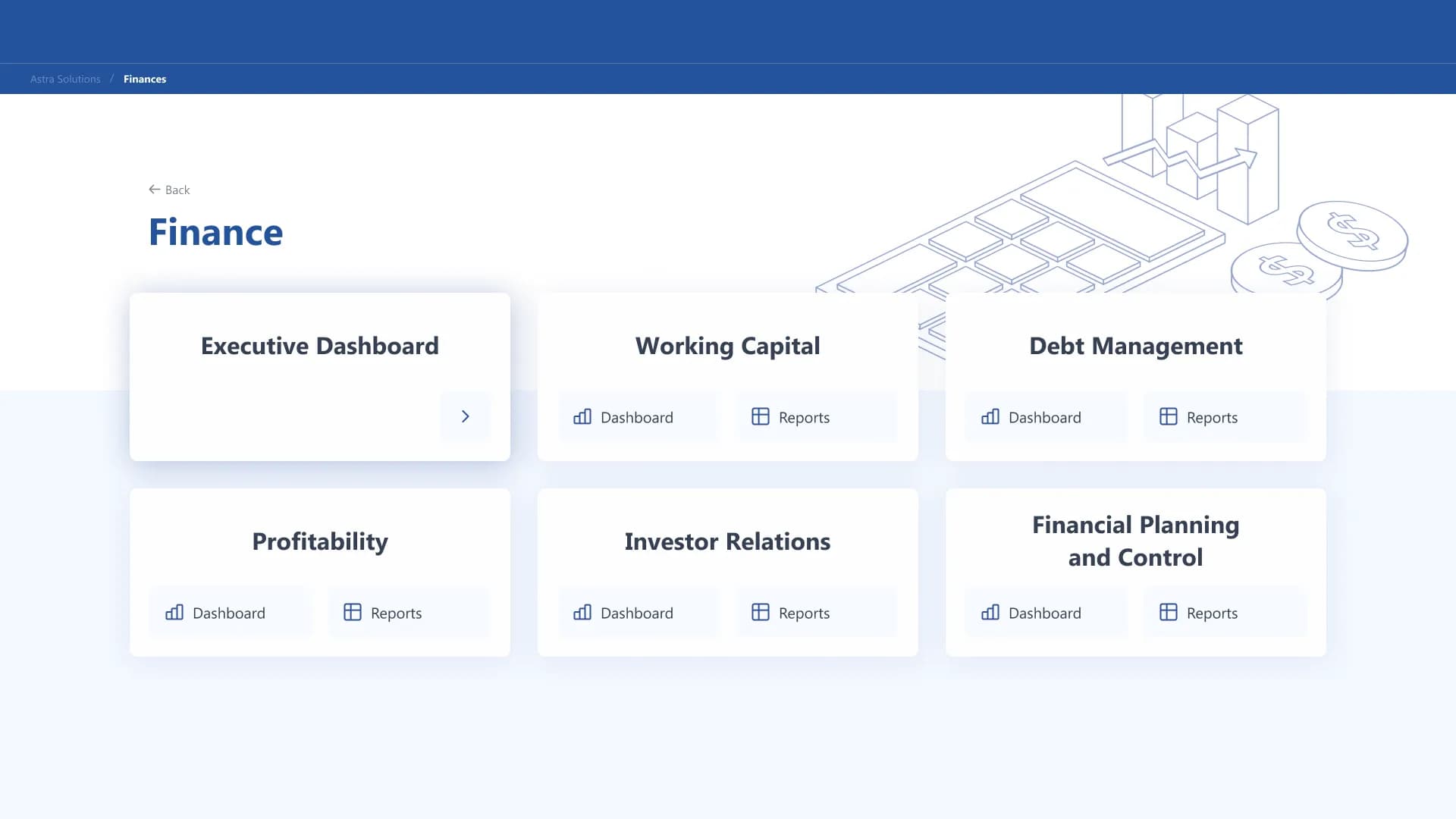
One good dashboard does not fix a company where forty analysts each build reports their own way. Here the deliverable is a BI design system: layout templates for recurring report types, a chart library with usage rules, colour and type standards, spacing tokens, and documentation an analyst can apply without a designer in the room.
The economics are those of any design system — expensive relative to one dashboard, cheap relative to the hundred that inherit it. It pays off on volume: multiple teams producing reports, executive reporting that must look credible externally, or a data product whose interface is the product. If your company produces three dashboards a year, skip this tier and buy the middle one.
What moves the price inside a tier
- Data complexity, more than screen count. A dashboard over clean agreed metrics is a design problem; over undefined metrics it is a workshop with design attached — worth it, but scope it knowingly.
- Stakeholder count. Every additional decision-maker adds a revision vector.
- Tool constraints at the edges — Power BI and Tableau each have layouts they quietly refuse to do well.
- Urgency, which prices like urgency always does.
Frequently asked questions
Do you need the data finished before design starts?
The metrics need to be defined; the pipeline does not. Design can run in parallel with data engineering as long as everyone agrees what the numbers mean.
Is dashboard design billed per screen?
Sometimes, but per-screen pricing rewards the wrong thing. The expensive work is the thinking and the system; the tenth screen on an existing system is the cheap part.
Can our analysts implement the design themselves?
Yes, if the handoff includes specs rather than pictures: exact colours, type sizes, spacing and chart rules. That is the difference between a design and a mood board.
Does this apply to client-facing analytics products?
The tiers shift up, because the interface is part of what customers pay for. There, dashboard design prices like product UI — which is what it is.
Keep reading
All articles
Dashboards as narrative, not noise
The dashboards people actually open read like editorial: a headline, a paragraph, an argument. The ones nobody opens tried to show everything.
Read article
What makes a good analytics dashboard — and what quietly ruins one
It fails one well-meaning addition at a time. Here is what a dashboard is actually for, and the six habits that quietly turn one into wallpaper.
Read articleNeed data that
drives decisions?
We design KPI dashboards and data products that surface what matters and let your team act fast.