Why executives ignore your dashboard
It has every number they asked for. They look for eleven seconds and go back to phoning an analyst. The data is almost never the problem.


The dashboard has every number the executive asked for. They open it, look for eleven seconds, and go back to asking an analyst on the phone. Within a month it is a tab nobody opens, and the team that built it concludes the executive “is not data-driven.”
We design dashboards and executive reporting for a living, and we have almost never seen this fail because the data was wrong. It fails because the screen answers “what do we have?” instead of the question the executive actually brought: is anything on fire, and what do I do about it?
The eleven-second read is the requirement, not the insult
An executive's first pass is a triage scan, and it deserves to be designed for. In those seconds the screen must answer three things: are we on track, what changed, and where should I look next. If the answer requires reading, filtering or remembering last month's number, the scan fails and trust starts leaking.
Our test is blunt: show the screen for ten seconds, take it away, ask what the situation is. If they recite widgets instead of a verdict — “there were some charts, revenue maybe?” — the dashboard has content but no message. Most enterprise dashboards fail this not because they show too little, but because they show everything at the same volume.
Hierarchy is the actual product
A dashboard where every metric gets equal billing is a spreadsheet with better fonts. The design work — what separates a reporting screen from decision support — is deciding what is loud and what is quiet.
- One primary answer per screen, stated as a number with its context: versus target, versus last period, with direction.
- Supporting metrics smaller and visibly subordinate, ordered the way an argument would use them.
- Exceptions promoted automatically — the metric that went wrong this week earns the weight, not the one that happens to sit top-left.
- Colour reserved for meaning. When red means “bad”, “category B” and “our brand” on one screen, red means nothing.
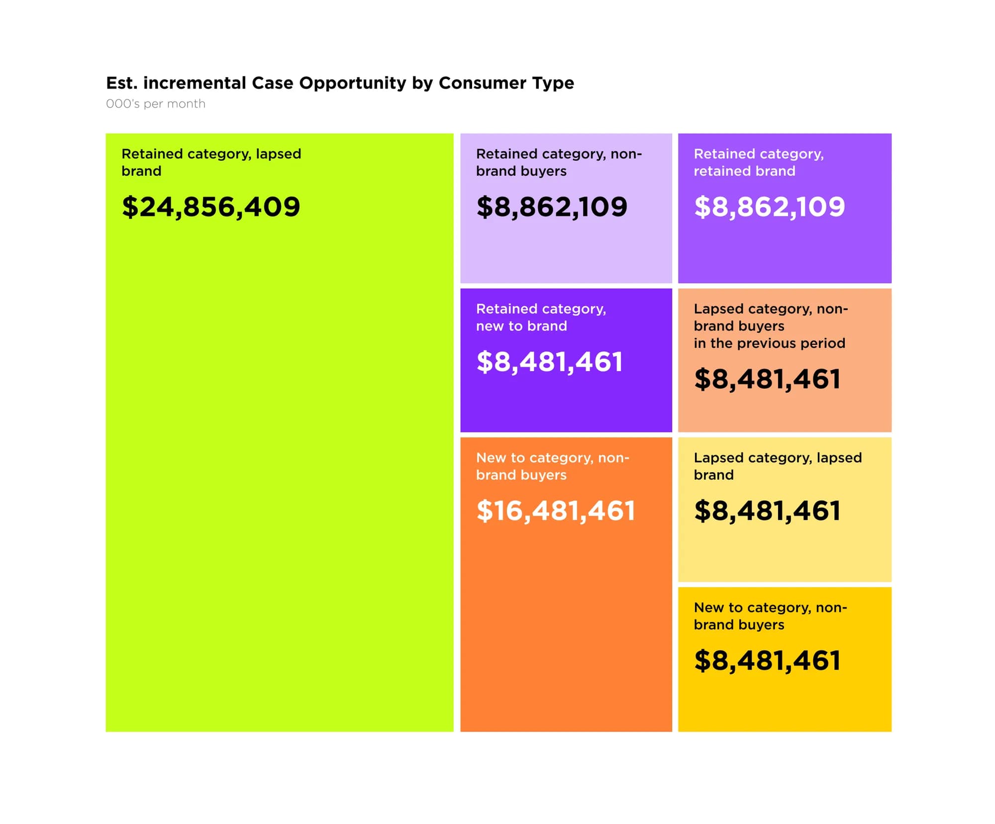
Cognitive load is a budget. Every gridline, legend, decimal place and duplicate label spends it. The dashboards people actually keep open are not the ones with more information — they are the ones where someone spent the information budget deliberately.
Built around decisions, not data sources
Most dashboard layouts mirror the data warehouse: a sales block, a marketing block, a finance block, because those were the tables. The layout that survives contact with executives mirrors their decisions instead: what needs intervention this week, what commitments are at risk, what is trending toward a problem.
Which is why the fix for an ignored dashboard is rarely “add more charts” and usually subtraction plus reordering. On a recent engagement the redesign removed roughly a third of the widgets, and the dashboard went from ignored to referenced in the weekly leadership meeting — same pipeline, same BI tool, different questions answered. The credibility gain is not cosmetic either: a cluttered dashboard reads as an unconfident team, and executives price that in whether they say so or not.
Where the line sits between a fast executive read and an analyst's workspace is its own decision — we draw it in dashboards for executives vs analysts, and build both in our dashboards and data design work.
Frequently asked questions
Should an executive dashboard fit one screen?
The verdict layer should. Drill-downs can go as deep as the data allows, but the first screen is a summary with an opinion, not a table of contents.
Power BI and Tableau defaults look decent — why restyle them?
Defaults are optimised to demo well, not to be read weekly. Chart junk, misused colour and template layouts survive by inertia. A style layer is cheap relative to the licences and changes whether the thing gets used.
How many KPIs is too many?
If everything is key, nothing is. Five to seven on the first screen with clear hierarchy beats twenty peers. The rest are one click away, which is where they belong.
Real-time or weekly?
Match the refresh to the decision cadence. A metric nobody can act on hourly does not need to update hourly — it just adds motion that reads as urgency and means nothing.
Keep reading
All articles
Dashboards as narrative, not noise
The dashboards people actually open read like editorial: a headline, a paragraph, an argument. The ones nobody opens tried to show everything.
Read article
What makes a good analytics dashboard — and what quietly ruins one
It fails one well-meaning addition at a time. Here is what a dashboard is actually for, and the six habits that quietly turn one into wallpaper.
Read articleNeed data that
drives decisions?
We design KPI dashboards and data products that surface what matters and let your team act fast.